The objective of today’s practice project is to redesign the Airbnb website to streamline and accelerate the onboarding process for new hosts. The focus will be on simplifying the user journey, providing clear guidance, and reducing the time required to become an active host.
This is the 11th design portfolio project for UI and UX designers looking to build a portfolio of credible work. A detailed client brief that is time-boxed, detailed, and crafted realistically enough to give you a hands-on experience of doing a real project. Each portfolio project is meant to help you create realistic work you can add to your portfolio and test if design really is for you.
As is usually the case, I have included the following with each design brief:
- Timeline (For this to be realistic each brief has a timeline that is as close to real-world work as possible)
- Objectives (What is REQUIRED by the client. This part usually trips designers up as they go off designing what is not required)
- Platform(Where your designs will live. Understanding these platforms will give a well-considered solution)
- Target audience (Users always come first and the design must accommodate the target audience’s pain points)
- References (If you are not sure where to start, clients normally give a set of examples or references they like. The closer the design solution is to the references, the fewer revisions a designer will have to do)
- Deliverables (Most importantly how the solution should be delivered. These represent what a well-detailed portfolio case study looks like so hit it out of the park)
- Recruiter advice (Portfolio advice from creative directors, CEOs and leading design creatives from the biggest companies)
Let’s begin.
Practice Project 11: Redesigning Airbnb Host Onboarding
Client: Airbnb
Timeline
1–2 weeks. The project is expected to be completed within two weeks.
Objectives
The objective is to redesign the Airbnb website to streamline and accelerate the onboarding process for new hosts. The focus will be on simplifying the user journey, providing clear guidance, and reducing the time required to become an active host.
Requirements:
- Simplified and intuitive host registration process
- Step-by-step guide for new hosts
- Enhanced user interface with clear calls to action
- Comprehensive resource center for new hosts (e.g., tutorials, FAQs)
- Integration of automated tools for profile verification and listing setup
- Improved customer support options (e.g., live chat, help center)
Success Metrics to Consider:
- Onboarding Time: Reduction in the average time taken to complete the onboarding process
- Conversion Rate: Increase in the number of users who successfully become hosts
- User Satisfaction: Improved ratings and feedback from new hosts
- Host Retention: Higher retention rate of new hosts within the first six months
Target Audience
1. Emily Smith,28 | The First-Time Host
Emily is a young professional eager to become a first-time Airbnb host. She needs a straightforward, step-by-step onboarding process with clear instructions and visual guides to help her set up her first listing confidently. However, she feels overwhelmed by the sheer amount of information and steps required, fearing she might make mistakes due to her lack of experience in managing property rentals and dealing with guests.
2. John Davis, 45 | The Part-Time Host
John is a busy professional looking to host part-time on Airbnb. He needs an efficient onboarding process that requires minimal time investment, along with tools that simplify the management of his listing. Despite his enthusiasm, John struggles with balancing hosting responsibilities with his demanding work schedule. He often finds the process frustrating, especially when technical difficulties arise or instructions are unclear, and he requires quick and responsive customer support to resolve any issues promptly.
3. Sarah Thompson, 52 | The Vacation Property Owner
Sarah is an experienced property investor with multiple vacation properties. She needs a reliable and comprehensive platform that supports the efficient management of multiple listings, along with access to market insights and analytics to optimize her listings and pricing. However, Sarah finds it complex to manage multiple properties, ensure they meet Airbnb’s standards, and handle guest inquiries seamlessly. The challenges of efficiently managing bookings and maintaining high standards across all properties add to her stress.
Specifications/ Limitations
Web
Reference
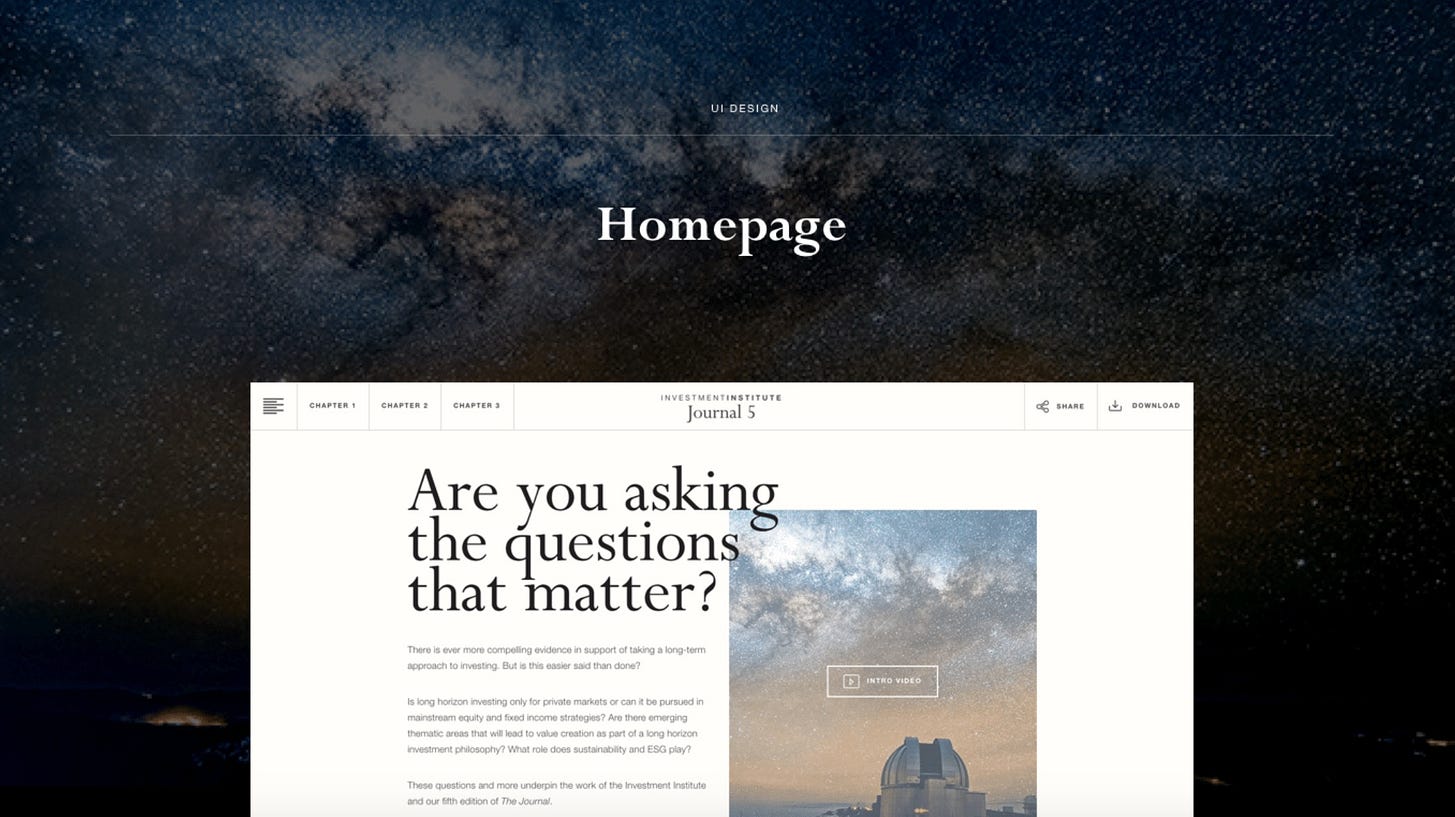
References that our company would like the new website to follow in terms of structure and layout. It will be your job to replicate something close to these examples but add your creative flair to it.
Vrbo:Vrbo
Booking.com:Booking.com
HomeAway:HomeAway
Deliverables
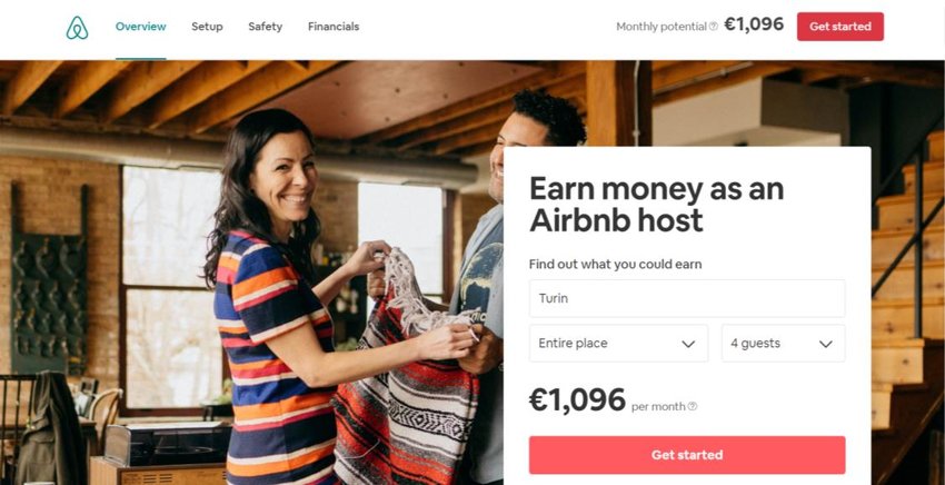
1. Home Page for Hosts: Enticing call-to-action, benefits overview, host testimonials, and sign-up button. Attract and encourage potential hosts to begin the onboarding process.
2. Registration Page: Simplified sign-up form with social media login options and a progress indicator. Make the registration quick and easy for new users.
3. Onboarding Dashboard: Step-by-step guide, checklist of tasks, progress tracker, and instructional videos. Provide a clear, guided onboarding experience.
4. Property Listing Setup: Interactive form for property details, real-time tips, and an image uploader. Streamline the property setup process.
5. Profile Verification: Identity verification tools, status updates, and document upload section. Simplify and clarify the verification process.
6. Host Dashboard: Listings overview, performance metrics, booking management, and guest communication tools. Offer a user-friendly interface for managing properties and tracking performance.


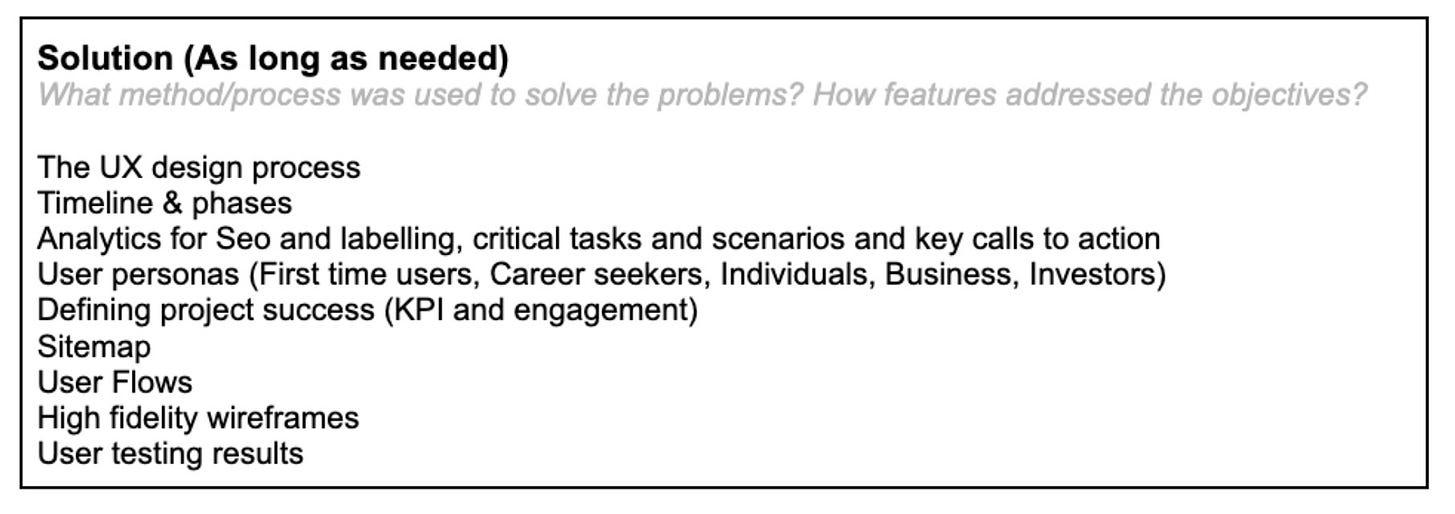
Testing and Results section
Show your wireframes to 5 people and ask them using your designs what they think about them, what they would improve, and an overall rating.
Take their feedback, iterate the designs, and have a final round of testing with 5 users. See that you improve your overall rating. If not go back to the drawing board and change your designs and retest.
What to do next
Download portfolio project PDFs of all the other existing design projects to do in your own time.