What is a UX Deliverable
A UX Deliverable is a design artefact, document, presentation, diagram, or report that is created at different stages of a product design process, usually by a UX designer. A UX deliverable is created for purpose of communicating ideas, research, work, tests and strategy to the internal team, stakeholders or clients. What is delivered may vary based on the type of product, budget, size of team and what is expected from developers and clients.
In this blog post, I will share some examples of UX deliverables I have done in my UX design role for several agencies and product companies. Only those with prior permission from clients are shown here so there is more I could not unfortunately share.

It is important to state that not all UX deliverables are necessary for every project because not every project nor company is the same. The UX maturity of the company, the available budget and number of designers can influence what the design process and deliverables look like.
The most commonly created UX deliverables
The Nielsen Norman Group ran an in-depth survey with UX professionals asking them about UX deliverables they produce on a regular basis and the following tables shows the results.
| Deliverable | UX Process Stage | Typical Format |
|---|---|---|
| Wireframes | Design | Web link to design file, PDF, PNG |
| Interactive Prototype | Design / Testing | Web link, HTML export |
| Flowchart / Activity Diagram | Research / Design | PDF, PNG, or embedded in presentation |
| Sitemap | Research / Information Architecture | PDF, image file, interactive link (e.g., Miro, FigJam) |
| Usability / Analysis Report | Testing / Evaluation | Google Doc, Slide deck, PDF, |
| User Journey Map | Research / Design | Miro/Mural/FigJam link, PNG, PDF, |
| Competitive Analysis Report | Discovery / Research | Google Slides, Excel/Google Sheets, PDF, |
| Concept Model / System Map | Discovery / Strategy | Miro/Mural/FigJam link |
| Personas | Research / Ideation | PDF, image file, presentation slide |
| Paper Prototype | Early Ideation / Testing | Photographs, scanned PDF, video walkthrough |
This presentation of UX deliverables loosely follows my design process. I will state when during the product process the deliverable was created, how long it takes to create and share UX deliverable examples from real client work.
Let’s begin.
Wireframes
What are wireframes
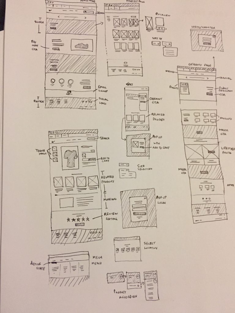
Wireframes (combined with Site Maps) are very useful for conveying the general page structure and content requirements for individual pages. Wireframes need to achieve a happy medium between being too precise and too loose. A wireframe that is too detailed (high fidelity) may leave little creative room for a UI designer but is a lot closer to the final implementation hence clients and developers love it. A wireframe that is not too well defined can easily be misinterpreted by designers and developers hence low fidelity wireframes are an early project stage deliverable from a client meeting or workshop. The format used should be dependent upon the audience that will see it.
Using detailed wireframes will frequently flush out new requirements and questions that nobody has thought about yet.
| When to create this UX deliverable: | During Design phase |
| How frequently is this delivered: | On every project, for every new feature or user flow |
| Who is this for: | Design team, client and development |

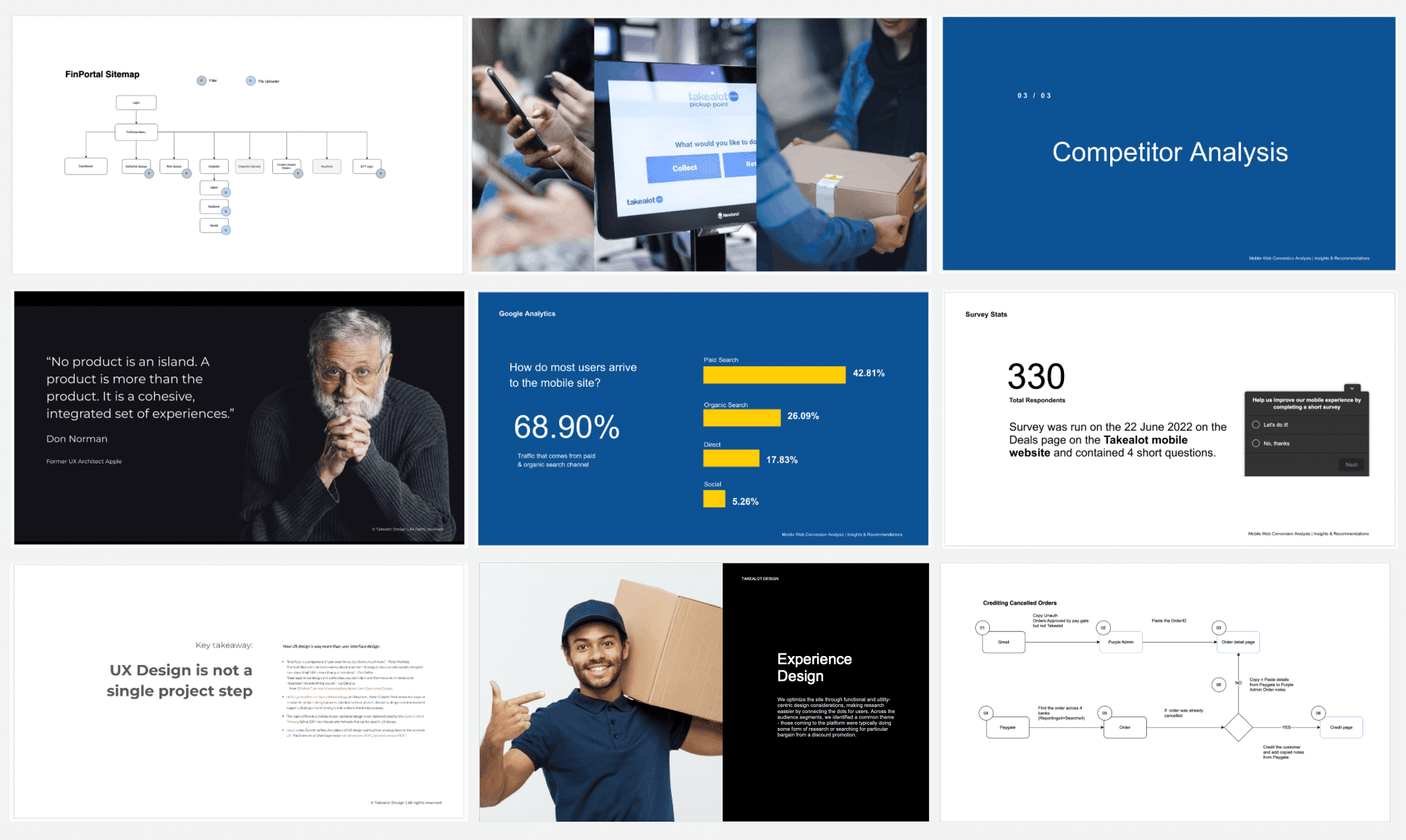
These UX wireframes were for a medical blog redesign. I put down several card layouts that directly tie to their business objectives like video views, shares and awareness before actually fleshing out the full page layouts.
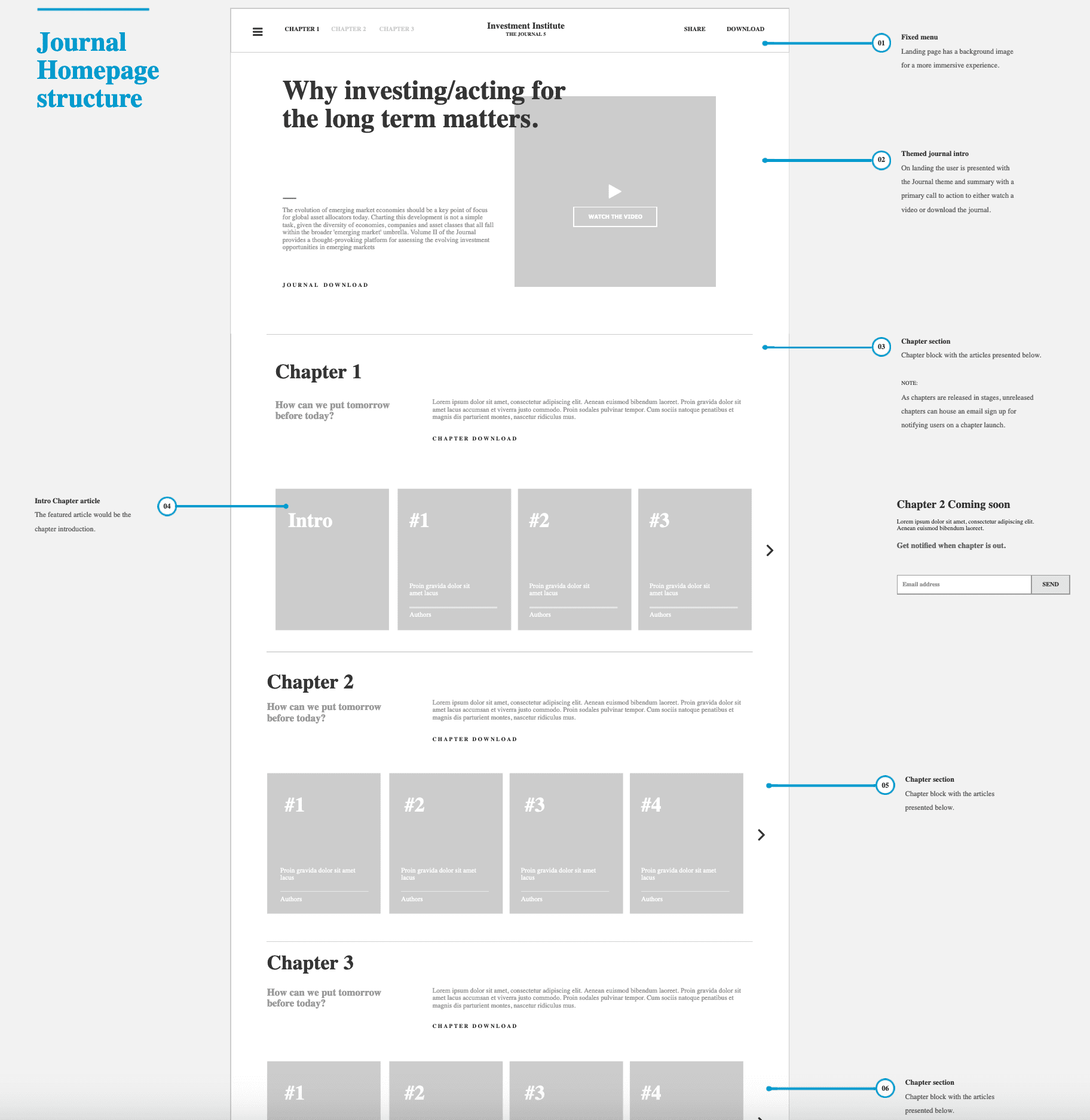
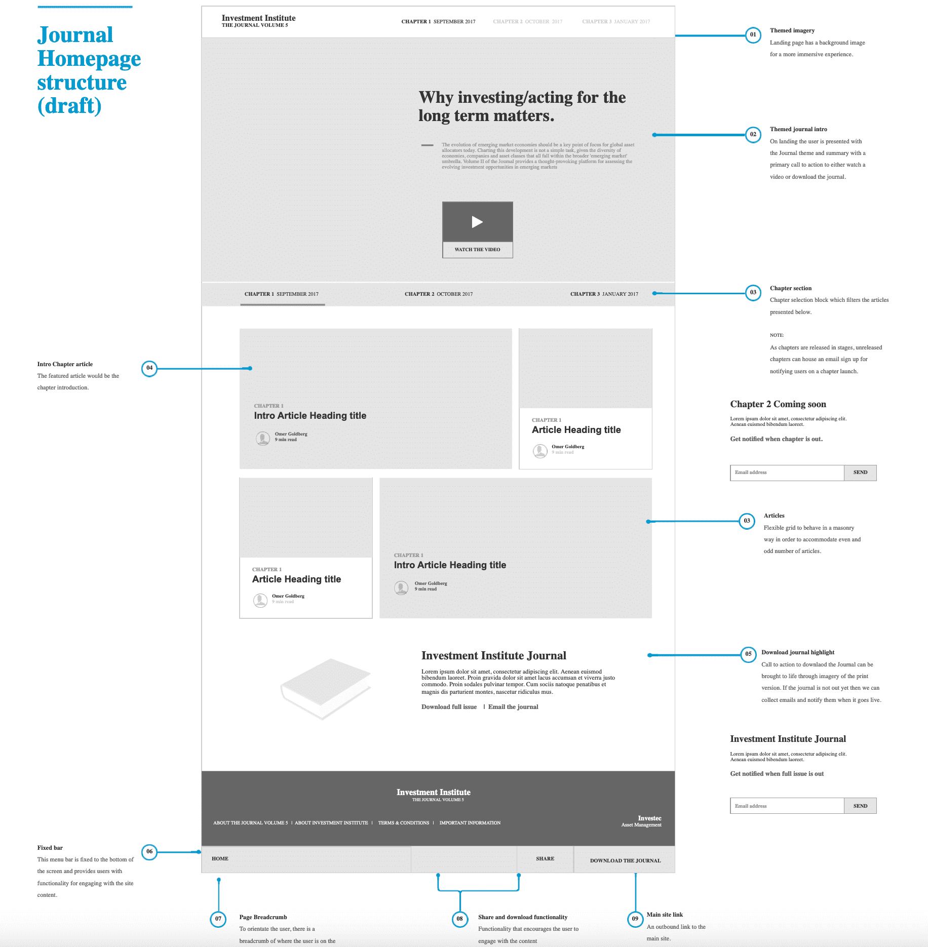
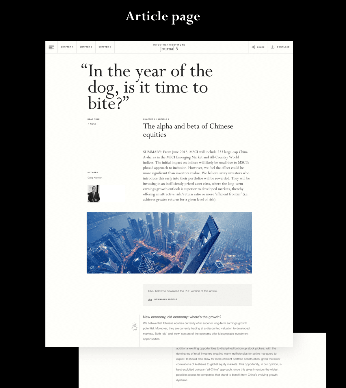
This wireframe deliverable was for a online asset management journal magazine specifically targeting investors and high net worth individuals. This is what a complete high fidelity wireframe layout can look like complete with annotations, typography and media placeholders. The wireframe went through several iterations of reviews with client and internal design team and this is what the initial wireframe draft looked like.
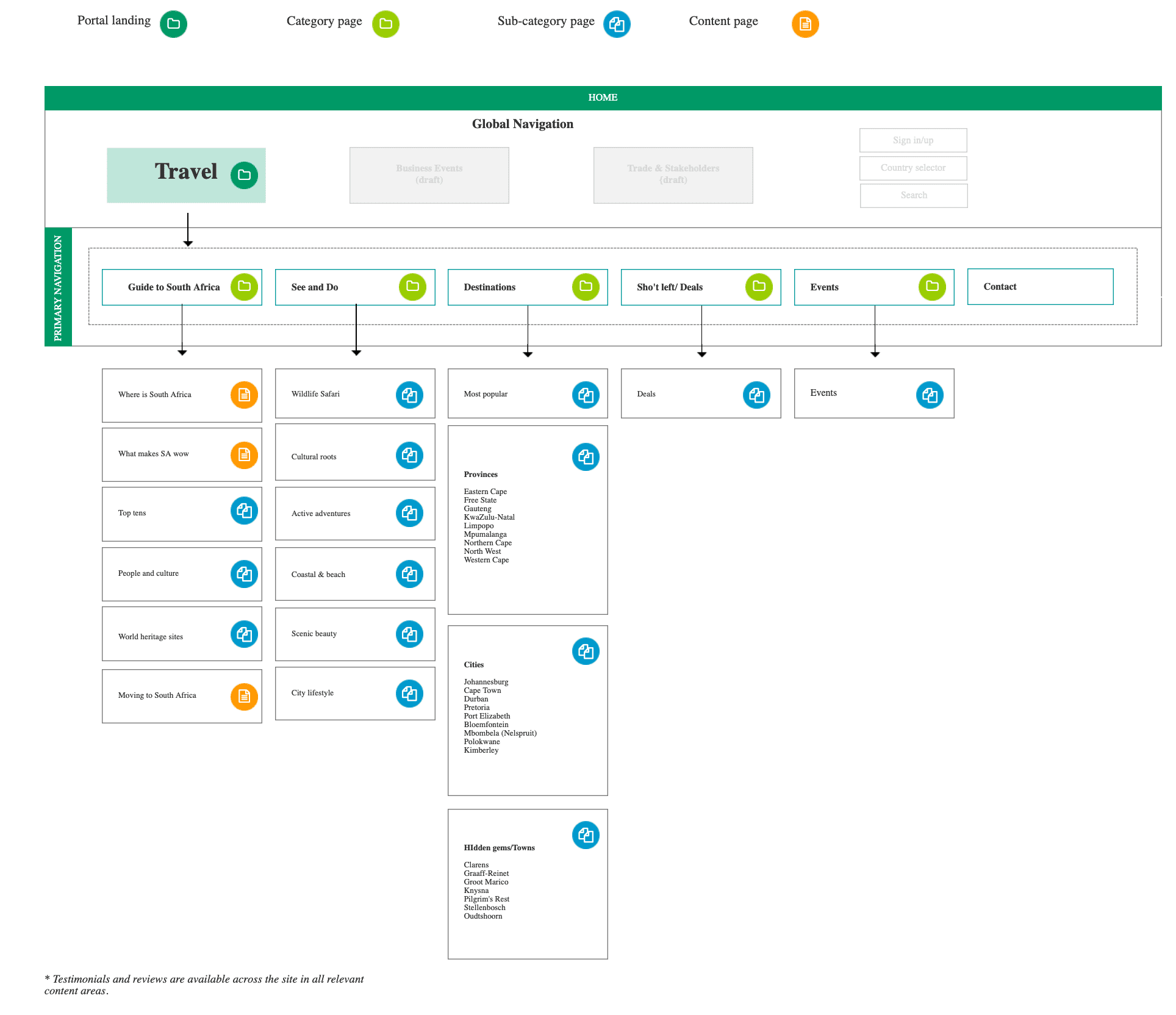
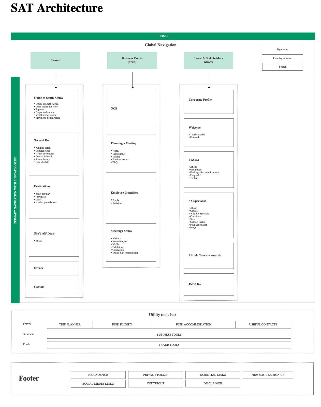
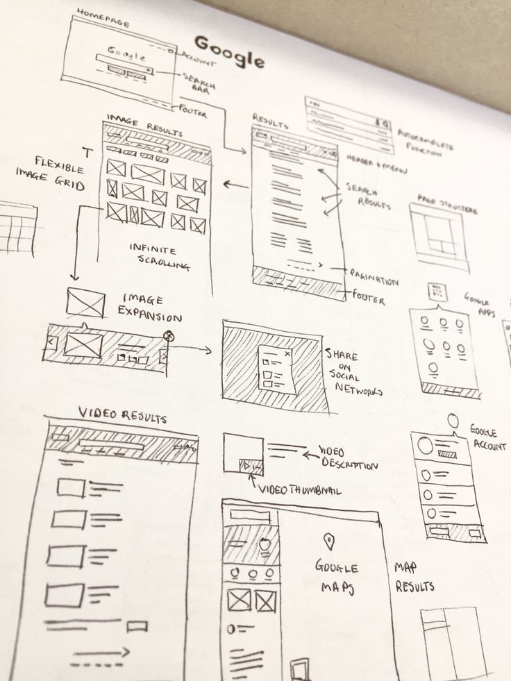
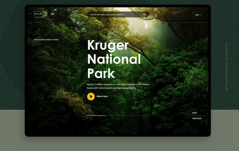
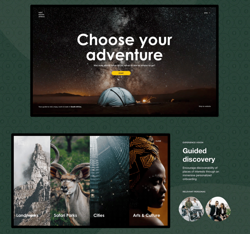
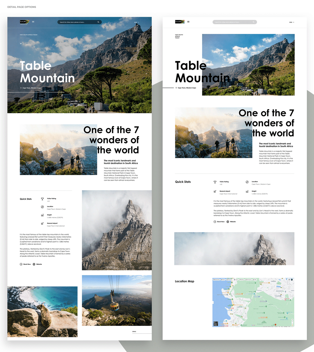
These next wireframe screens are from the redesign of the South Africa’s Tourism site. The brief was to redesign and consolidate multiple divisions into one site. As part of a 40 page wireframe deliverable,these screenshots show 4 pages. The first being how a global navigational menu was going to cater for switching between multiple divisions, different device dimensions, logged in states, and future menu states.
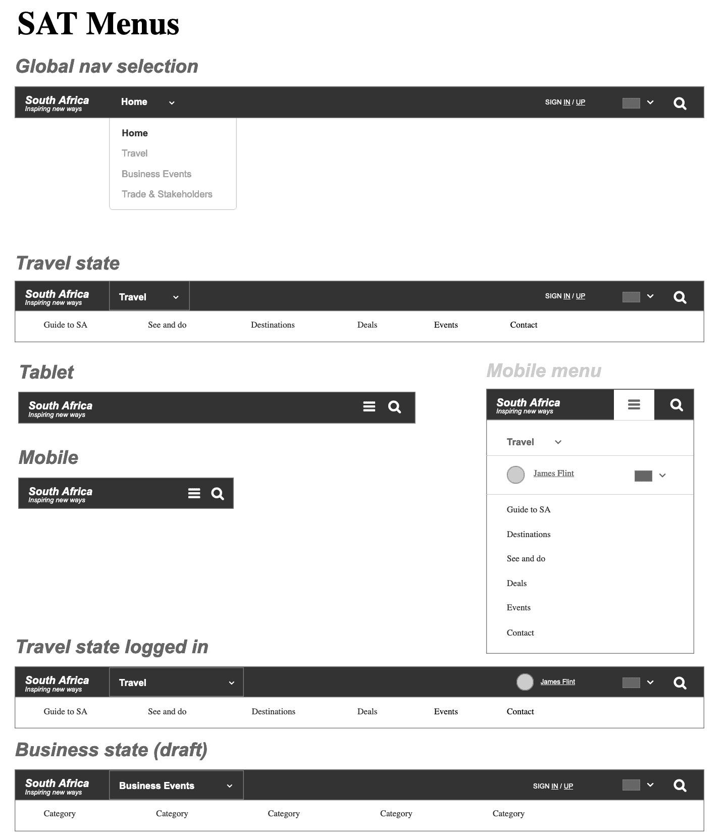
The other three screens show the Homepage wireframe, an onboarding experience, and a category page.

Interactive Prototype
This a natural progression from the wireframe deliverable where one seeks to show how users move from one wireframe screen to another. Most design tools like Axure, Figma, Sketch have prototyping capabilities that allow you to connect any element on the page to another page thereby showcasing user scenarios. In most cases the prototype is uploaded to a web link through the design tool which makes sharing with clients and developers far easier than presenting the prototype on your local machine.
| When do you create this UX deliverable: | During design/testing phase as a means of illustrating how each screen connects to one another. |
| How frequently is this delivered: | Not frequent. Depends on the complexity of flows and states and whether the screens need to be tested. |
| Who is this for? | As a means of educating the company/clients and the product team how a user can move between screen in a real device screen or testing a flow with prospective users to gather early user feedback. |
In Sketch the prototyping state visibly shows lines from the point of interaction to the screen is will render when clicked or tapped.
Axure RP is a unique UX prototyping tool because it actually creates prototypes as HTML, CSS and Javascript code thereby creating very realistic design solution that a user can play around with. This is an example of the interaction for a prototype that showcases the functionality and layout design on the Nike.com site.
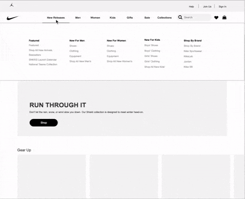
An Axure prototype of the Nike.com website
Personas
A user profile or persona is a realistic (but likely fictional) example of a target audience member. The profile commonly takes the form of a one page piece that lists the user’s name, occupation, education, demographic characteristics, computer/web experience, and site goals or likely tasks. A stock photography picture is usually used to give a face to the profile.
| When do you create this UX deliverable: | During analysis phase as a means of summarising customer market data into specific user groups/profiles |
| How frequently is this delivered: | You might need to roughly create 3 to 6 personas for a large site/portal. Collating data and creation can take some time but is very useful once built. Not a deliverable you will create frequently. |
| Who is this for? | As a means of educating the company/clients and the product team |
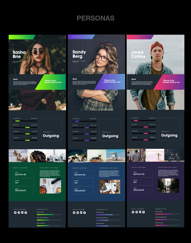
These are the main personas for a tourism website redesign project. Personas were created from Google Analytics data and customer research data.


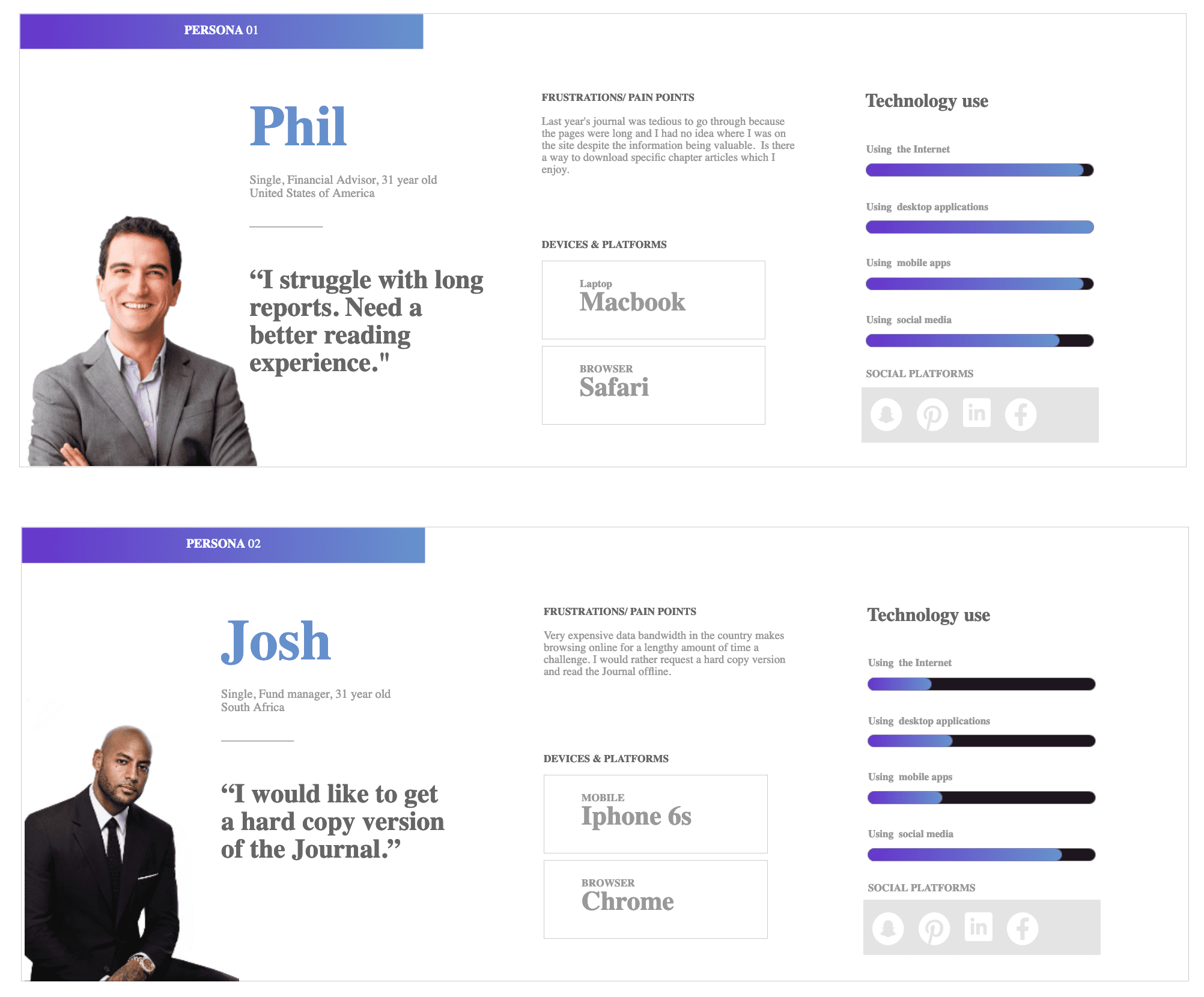
These are personas for an asset management website redesign. User data was from customer information, interviews and Google Analytics.
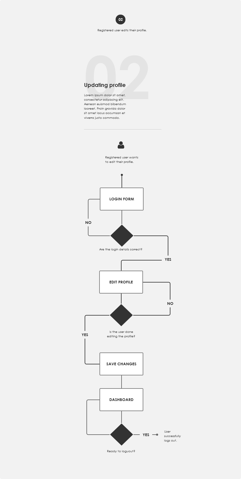
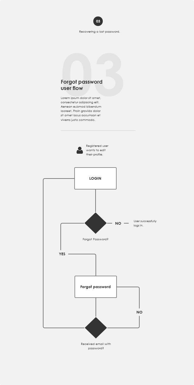
User Journeys
This is a diagram that illustrates the steps a user takes through a website, application or service to perform a particular goal. Once visually mapped out, it is usually very easy to identify unnecessary steps, problematic steps/stumbling blocks and create workarounds for a particular task.
| When to create this UX deliverable: | During Analysis phase when a user’s path through an application needs to be mapped and optimized. Usually an existing application. |
| How frequently is this delivered: | Arguably created on 50% of the projects depending on budget and timelines |
| Who is this for: | Mainly for developer handover |


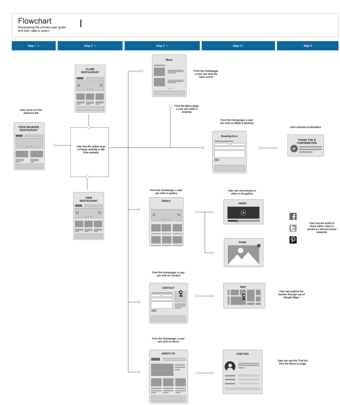
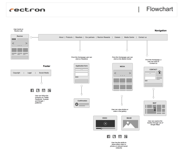
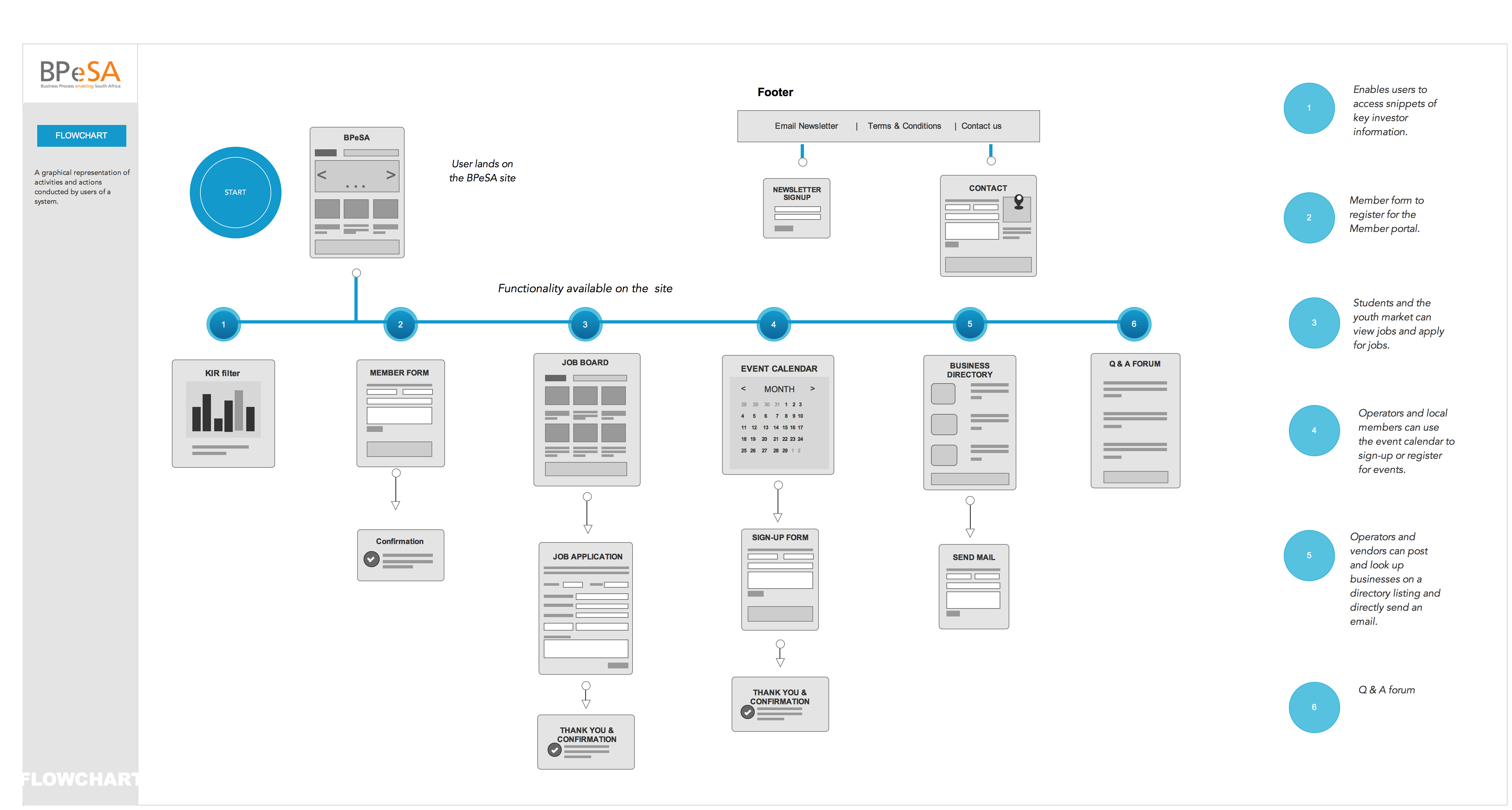
Flowchart
A workflow diagram (or activity diagram) that is graphical representation of activities and actions conducted by users of a system. It differs from a user journey in that it captures all the tasks that can be performed on the entire system/application/service as opposed to a single task. Probably one of my favorite deliverable because it provides an overall view on the entire site’s user flows.
| When to create this UX deliverable: | During Analysis phase to map out all system/website activities |
| How frequently is this delivered: | Quite frequently |
| Who is this for: | Mainly developer handover as part of a specification document |

Competitor analysis report
Probably the most frequent method of establishing a intuitive design approach from a new application by drawing from how other competitors in the market have implemented. Performing a basic audit, review, user test or heuristic evaluation of competing websites/ systems/applications for the purpose of identifying gaps and opportunities. The deliverable is a report that summarises the competitive landscape and recommendations.
| When to create this UX deliverable: | During Discovery phase to gather information and identify gaps and new features |
| How frequently is this delivered: | Not frequently; there may be enough existing data research at the start of the project |
| Who is this for: | Stakeholders and client presentations |
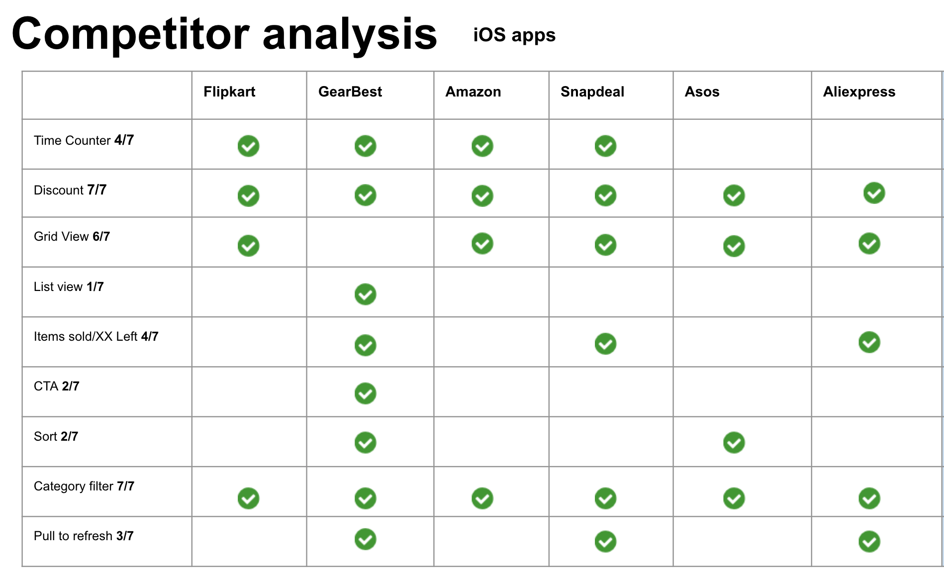
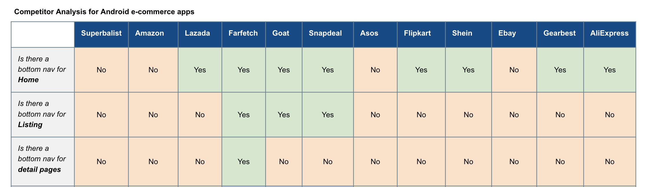
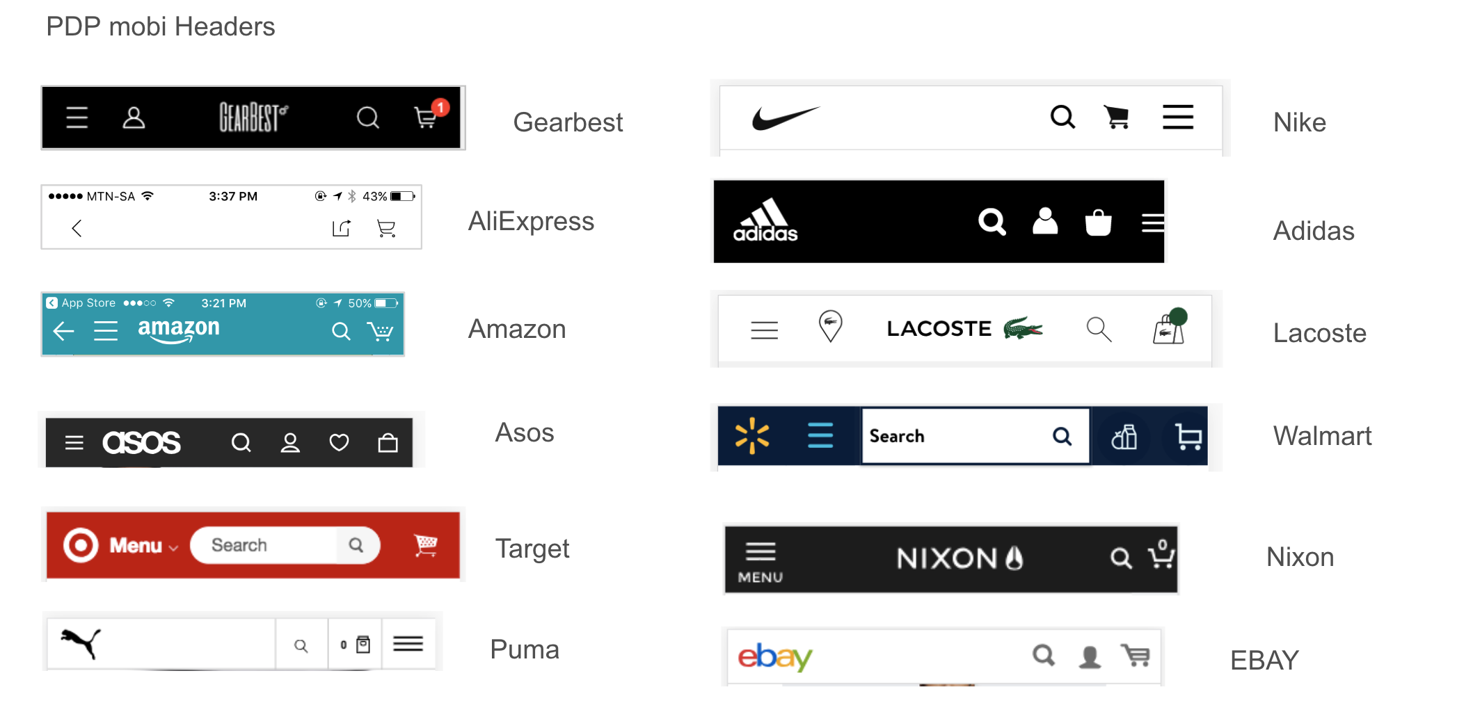
Here is an example of a competitor analysis for search results page features on IOS for an ecommerce site, analyzing international brands from developed and emerging markets. This helps us identify which features are universally found on other competitor apps and hence a must have for our app but also unique trends that we can gain an advantage from.
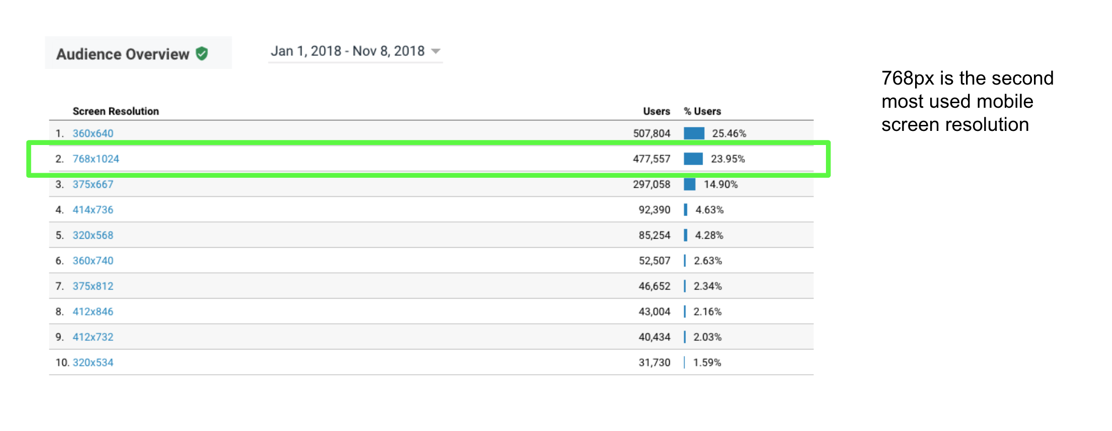
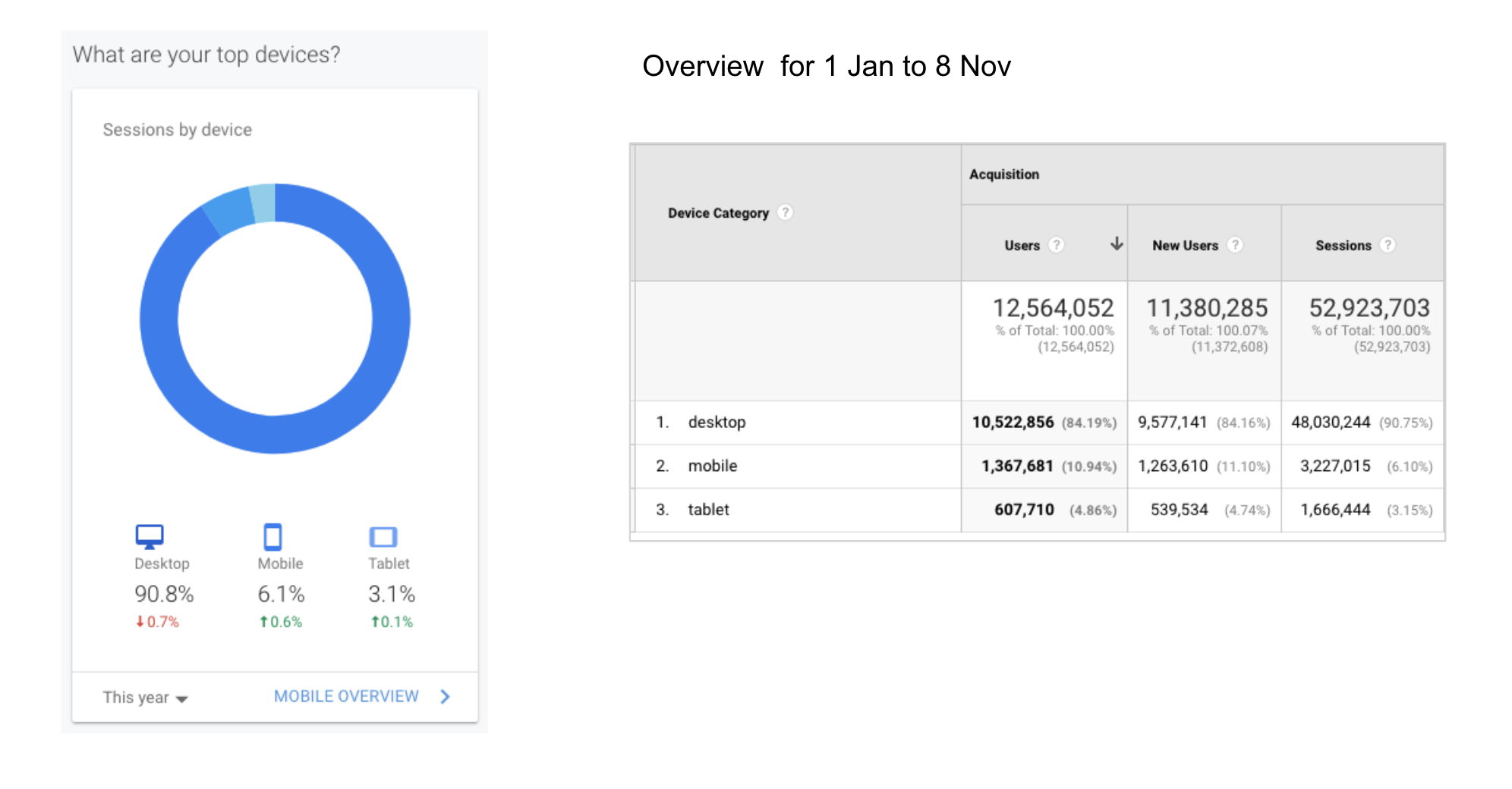
Google analytics data report
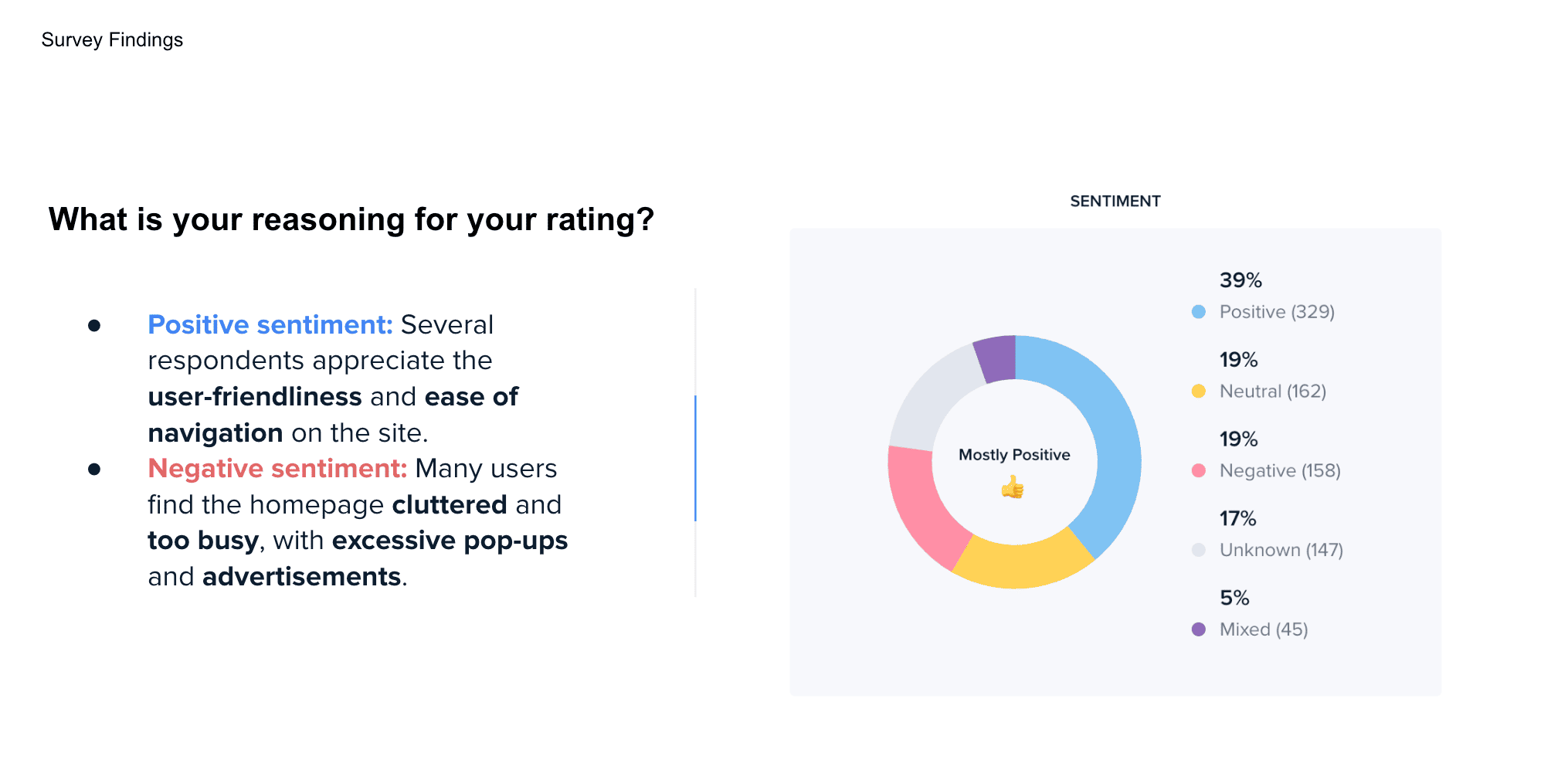
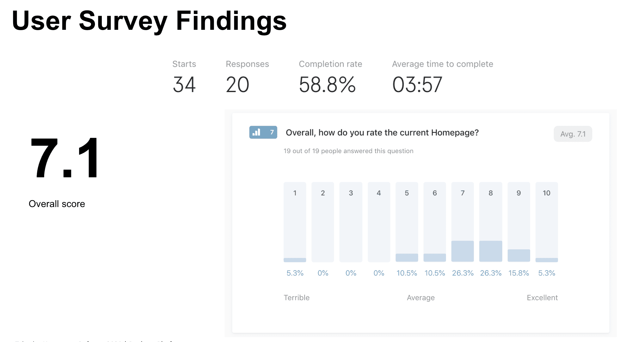
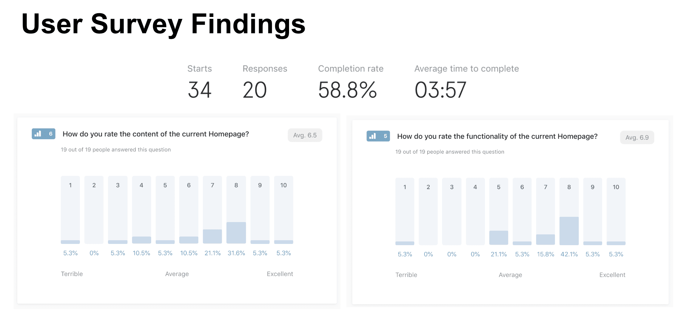
There are metrics that can be tracked on an existing platform whether its a website or app. Google Analytics provides data for users to get insight into how the platform is being used, which screens are doing well, where users are exiting, how long they stay on the platform and how the platform is performing against predefined benchmarks.
A Google analytics report will contain specific metrics that have been tracked over a certain time period, that are useful in identifying areas of improvement. Coupled with prioritized recommendations, this report is present to both client and the team to work out action points and next steps.
| When to create this UX deliverable: | During Discovery phase to gather information and continuously post-launch to track usage(can be automatically set up) |
| How frequently is this delivered: | Potentially bi-weekly or monthly depending on the nature of the platform and how much the data changes over time |
| Who is this for: | Internal team and client |

Sitemaps
Site maps are one of the most critical and widely used information architecture deliverables (along with wireframes). They show the overall structure and hierarchy of a platform. Sitemaps can be used as the first step in laying out the information architecture of a new site/app, and will provide the framework upon which to base platform development. For existing platforms, sitemap will define where new features, categories and pages fit in the overall picture.
Card sorting is a technique where users help to generate a sitemap or information hierarchy, which can then form the basis of a navigation structure or menu.

Sitemaps help to get everyone on the same page around how much work needs to be done, the scope of the project, deadlines and budget discussions.
| When to create this UX deliverable: | During Analysis phase to map out what categories, their hierarchy and screens that will be needed |
| How frequently is this delivered: | Usually a sitemap is created when a platform is first built and revised when new categories and entire sections need to be added or removed |
| Who is this for: | Design team, client and development |


Sketches
One of my favorites design artefacts to create which is ironically disposable. Sketching provides a means of rapidly trying out different ideas cheaply on paper before logging onto a design app. Therefore it is useful for brainstorming sessions with the team, with developers or even with clients.
One can sketch out flowcharts, sitemaps, features, states or even entire screens to run past the audience.
| When to create this UX deliverable: | Any phase when it is necessary to visually brainstorm and play out ideas fast |
| How frequently is this delivered: | Depends on the complexity of the product being created and how much communication is required |
| Who is this for: | Mainly for yourself and as a means of communicating ideas to fellow team members or clients |


User testing report
This report will captured what method of testing was conducted with users, how big the sample group was, the findings and the recommendations. There are a range of testing methods that can be employed by a designer and each one will be dependent on location, budget, team size and nature of the project.
| When to create this UX deliverable: | During Testing phase |
| How frequently is this delivered: | Whenever testing is conducted with users |
| Who is this for: | Design team and client |


UI design deliverables
This is not a core UX deliverable as most UX designers do not have a visual graphics background nor is it their core responsibility. However if you have the UX/UI or UI/UX position in a company, you will be expected to produce visual mockups of the final product.
| When to create this deliverable: | During Design phase |
| How frequently is this delivered: | On every project especially if you are a UI designer |
| Who is this for: | Design team, client and development |


User Survey, Site Audit
Survey – A high level review of a site’s main sections and pages. It enables you to develop an understanding of the general site scope and major chunks of content from the customers point of view.
- Detailed Audit – this is a comprehensive inventory of every page on a site. This inventory will list every page’s filename, title, URL, and possibly its file type and a description. It’s also helpful to assign a unique page ID that will correspond to the pages location on the sitemap.
- Content Map – This simply entails laying out the site content in a graphical format. I haven’t seen this used widely, and I’m not sure how much use it would serve. If you’re performing a content inventory on a current site, then a site map might nullify the need for a content map.
| When to create this UX deliverable: | During Discovery phase |
| How frequently is this delivered: | On every project where new site is being created or when large changes are being implemented |
| Who is this for: | Design team, client and development |