Today we evaluate a UX portfolio from a designer who transitioned from being an Educator to Product design. Before Hana Nakano found her passion for product design, she spent the majority of her 20s as a classroom teacher but I realized that life’s too short to stay in her comfort zone. This is not a great case study but there is plenty to learn from it.
As usual I will highlight what UX recruiters and UX hiring managers look for when evaluating such a portfolio using emojis to indicate my emotions.
Let’s begin.
Product Designer Portfolio example — Landing page
Takeaways:
Use project thumbnails that help the recruiter understand what platform the design was for.
Ensure contact details and resume are easily accessible.
Be explicit in explaining how research is conducted, who was involved and what the findings are.
Try to explain how the design improves metrics
Show your portfolio to two people to double check the case study.
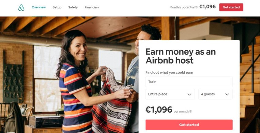
The objective of today’s practice project is to redesign the Airbnb website to streamline and accelerate the onboarding process for new hosts. The focus will be on simplifying the user journey, providing clear guidance, and reducing the time required to become an active host.
Airbnb redesign practice project
This is the 11th design portfolio project for UI and UX designers looking to build a portfolio of credible work. A detailed client brief that is time-boxed, detailed, and crafted realistically enough to give you a hands-on experience of doing a real project. Each portfolio project is meant to help you create realistic work you can add to your portfolio and test if design really is for you.
As is usually the case, I have included the following with each design brief:
Timeline(For this to be realistic each brief has a timeline that is as close to real-world work as possible)
Objectives(What is REQUIRED by the client. This part usually trips designers up as they go off designing what is not required)
Platform(Where your designs will live. Understanding these platforms will give a well-considered solution)
Target audience (Users always come first and the design must accommodate the target audience’s pain points)
References(If you are not sure where to start, clients normally give a set of examples or references they like. The closer the design solution is to the references, the fewer revisions a designer will have to do)
Deliverables(Most importantly how the solution should be delivered. These represent what a well-detailed portfolio case study looks like so hit it out of the park)
Recruiter advice(Portfolio advice from creative directors, CEOs and leading design creatives from the biggest companies)
Let’s begin.
Practice Project 11: Redesigning Airbnb Host Onboarding
Client: Airbnb
Timeline 1–2 weeks. The project is expected to be completed within two weeks.
Objectives
The objective is to redesign the Airbnb website to streamline and accelerate the onboarding process for new hosts. The focus will be on simplifying the user journey, providing clear guidance, and reducing the time required to become an active host.
Requirements:
Simplified and intuitive host registration process
Step-by-step guide for new hosts
Enhanced user interface with clear calls to action
Comprehensive resource center for new hosts (e.g., tutorials, FAQs)
Integration of automated tools for profile verification and listing setup
Improved customer support options (e.g., live chat, help center)
Success Metrics to Consider:
Onboarding Time: Reduction in the average time taken to complete the onboarding process
Conversion Rate: Increase in the number of users who successfully become hosts
User Satisfaction: Improved ratings and feedback from new hosts
Host Retention: Higher retention rate of new hosts within the first six months
Target Audience
1. Emily Smith,28 | The First-Time Host
Emily is a young professional eager to become a first-time Airbnb host. She needs a straightforward, step-by-step onboarding process with clear instructions and visual guides to help her set up her first listing confidently. However, she feels overwhelmed by the sheer amount of information and steps required, fearing she might make mistakes due to her lack of experience in managing property rentals and dealing with guests.
2. John Davis, 45 | The Part-Time Host
John is a busy professional looking to host part-time on Airbnb. He needs an efficient onboarding process that requires minimal time investment, along with tools that simplify the management of his listing. Despite his enthusiasm, John struggles with balancing hosting responsibilities with his demanding work schedule. He often finds the process frustrating, especially when technical difficulties arise or instructions are unclear, and he requires quick and responsive customer support to resolve any issues promptly.
3. Sarah Thompson, 52 | The Vacation Property Owner
Sarah is an experienced property investor with multiple vacation properties. She needs a reliable and comprehensive platform that supports the efficient management of multiple listings, along with access to market insights and analytics to optimize her listings and pricing. However, Sarah finds it complex to manage multiple properties, ensure they meet Airbnb’s standards, and handle guest inquiries seamlessly. The challenges of efficiently managing bookings and maintaining high standards across all properties add to her stress.
Specifications/ Limitations
Web
Reference
References that our company would like the new website to follow in terms of structure and layout. It will be your job to replicate something close to these examples but add your creative flair to it.
1. Home Page for Hosts: Enticing call-to-action, benefits overview, host testimonials, and sign-up button. Attract and encourage potential hosts to begin the onboarding process.
2. Registration Page: Simplified sign-up form with social media login options and a progress indicator. Make the registration quick and easy for new users.
3. Onboarding Dashboard: Step-by-step guide, checklist of tasks, progress tracker, and instructional videos. Provide a clear, guided onboarding experience.
4. Property Listing Setup: Interactive form for property details, real-time tips, and an image uploader. Streamline the property setup process.
5. Profile Verification: Identity verification tools, status updates, and document upload section. Simplify and clarify the verification process.
6. Host Dashboard: Listings overview, performance metrics, booking management, and guest communication tools. Offer a user-friendly interface for managing properties and tracking performance.
Testing and Results section
Show your wireframes to 5 people and ask them using your designs what they think about them, what they would improve, and an overall rating.
Take their feedback, iterate the designs, and have a final round of testing with 5 users. See that you improve your overall rating. If not go back to the drawing board and change your designs and retest.
What to do next
Download portfolio project PDFs of all the other existing design projects to do in your own time.
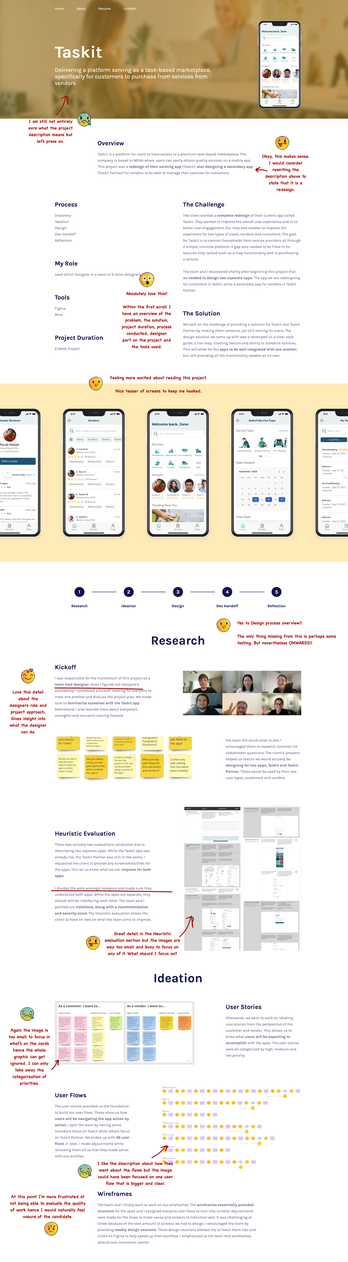
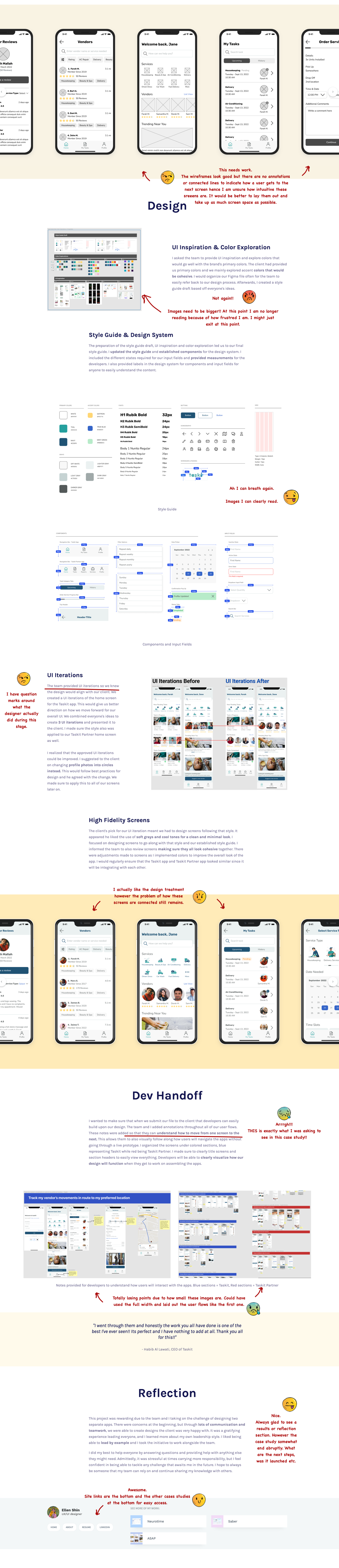
We will evaluating a Junior UX designer’s portfolio who transitioned from a UX/UI designer to a UX Designer in 2023. Ellen Shin is a currently a UX designer based in northern VA and her academic background is in communication and graphic design. We will evaluate the portfolio as a recruiter would when going through design application for a UX role. There are some obvious mistakes that I identified that one should avoid but overall a good portfolio for a Junior designer starting out.
Takeaways:
Ensure you have large clear images of work so that an recruiter can easily evaluate it.
If you frustrate a recruiter who is going through your design work, they can move on from your portfolio to the next one despite how good the work is. Keep things simple and clear.
Present work like wireframes and visual designs with headings, annotations and connected lines to better communicate work
Today’s design brief is to redesign Renault’s South African car dealership website. This was an actual real project that I worked on at my digital agency but for Toyota Global. For this brief I have changed names and some details. This is the 7th design brief or practice project for UI and UX designers looking to build a portfolio of credible work. Each detailed client brief is time-boxed, detailed, and crafted realistically enough to give you a hands-on experience of doing a real project. The design brief is meant to help you create realistic work you can add to your portfolio and test if design really is for you.
As is usually the case, I have included the following sections with each design brief:
Timeline(For this to be realistic each brief has a timeline that is as close to real-world work as possible)
Objectives(What is REQUIRED by the client. This part usually trips designers up as they go off designing what is not required)
Platform(Where your designs will live. Understanding these platforms will give a well-considered solution)
Target audience (Users always come first and the design must accommodate the target audience’s pain points)
References(If you are not sure where to start, clients normally give a set of examples or references they like. The closer the design solution is to the references, the fewer revisions a designer will have to do)
Deliverables(Most importantly how the solution should be delivered. These represent what a well-detailed portfolio case study looks like so hit it out of the park)
Recruiter advice(Portfolio advice from creative directors, CEOs and leading design creatives from the biggest companies)
This will help you build your case study much faster as the project objectives and such are provided.
1–2 weeks. The project is expected to be completed within two weeks.
Objectives
We are looking to redesign the official Renault website in South Africa. The site should provide a seamless experience for potential customers to browse our catalogue, book a test drive and purchase vehicles from our dealership. The website will be the primary sales tool for our business, and we want it to be easy to use, informative and visually appealing.
Success Metrics to Consider: Conversion rate: The percentage of website visitors who purchase a vehicle or schedule a test drive. User engagement: The amount of time visitors spend on the website and the number of pages they visit. Search performance: The number of visitors who use the search function and the accuracy of the search results. Customer satisfaction: Feedback from customers who use the website to purchase a vehicle or schedule a test drive.
This is the current site:
Platform
Please design website screens for desktop (1440px wide and mobile view 365px wide).
Target Audience
John, 35 | Busy Executive NEEDS A quick and easy way to search for cars that fit his budget and preferences. He is also interested in finance and insurance options that can be bundled with his purchase. Schedule is very tight and he doesn’t want to be haggled by salespeople at a dealership.
Sarah, 28 | First-time Car Buyer NEEDS Needs guidance and information about the car buying process. She also wants to compare different models and prices to make an informed decision. She is not familiar with the technical terms used in the car industry, which can make her feel overwhelmed. She is also on a tight budget and needs to find a car that is affordable but still reliable.
Robert, 50 | Experienced Car Enthusiast NEEDS Looking for a dealership that specializes in luxury cars and can provide him with personalized service. He is interested in the latest models and technology features. Robert has high expectations and wants to be treated like a VIP. He is not interested in mass-produced cars and wants a dealership that can provide him with unique and exclusive options.
Specifications/ Limitations
Site must load quickly hence any large interactions must be kept to a minimum.
• Research and testing conducted • Wireframes/UI designs of ⁃ Homepage: Welcome message, featured vehicles, search function ⁃ Search results page: List of vehicles that match search criteria ⁃ Vehicle detail page: Vehicle photos, specifications, pricing, reviews, similar vehicles ⁃ Schedule test drive page: Form to schedule a test drive, available dates and times ⁃ Request quote page: Form to request a price quote, additional information ⁃ Contact us page: Contact information, form to send a message ⁃ Checkout page: Vehicle details, pricing, financing options, payment information
Testing and Results section
Show your wireframes to 5 people and ask them using your designs what they think about them, what they would improve, and an overall rating.
Take their feedback, iterate the designs, and have a final round of testing with 5 users. See that you improve your overall rating. If not go back to the drawing board and change your designs and retest
What to do next
Download portfolio project PDFs of all the other existing design projects to do in your own time.
Portfolio Advice from recruiters
I love to see how designers tackle complex problems in their portfolio case studies. It’s important to not only show the final product, but the process that got you there. – Satish Kanwar, VP of Design at Shopify
I want to see a clear articulation of the problem, the design process, and the impact of the solution. Numbers and metrics are important, but so is the story behind them. – Khoi Vinh, Principal Designer at Adobe
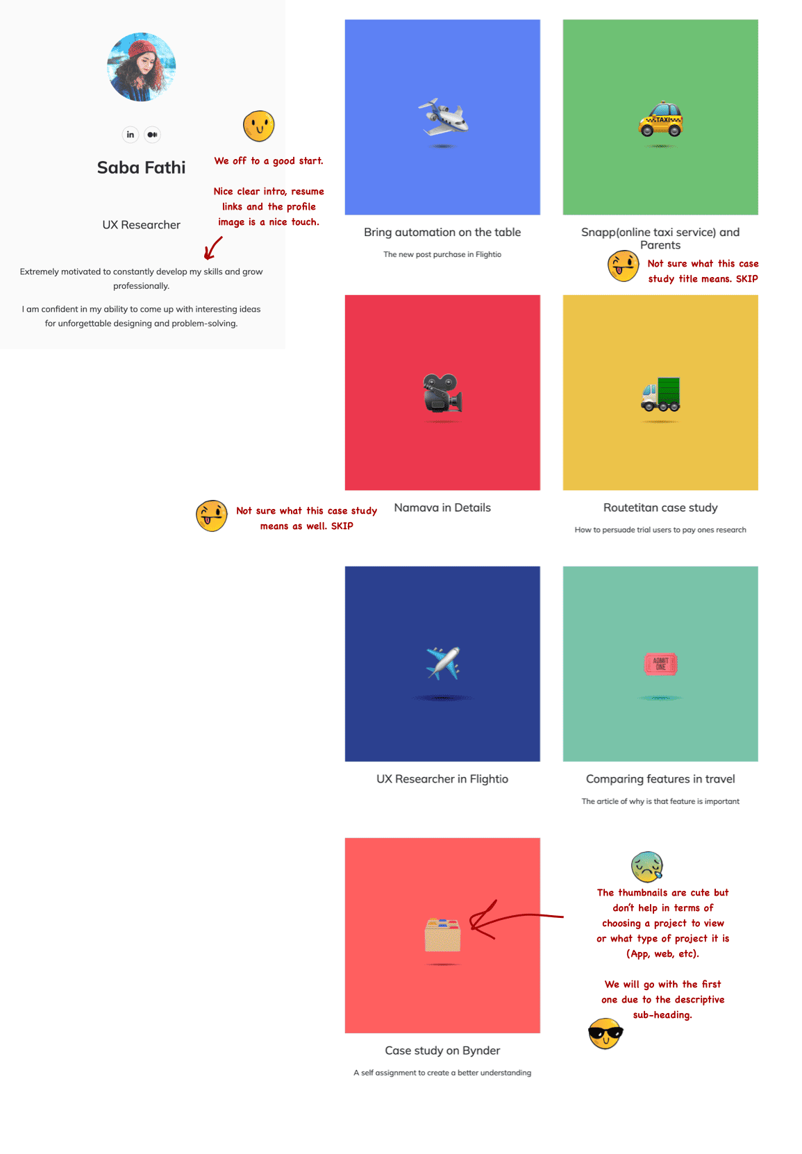
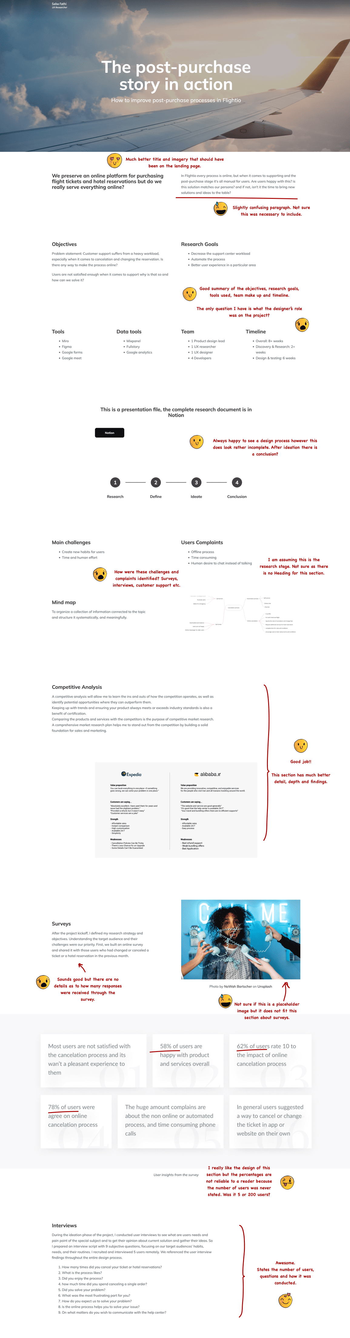
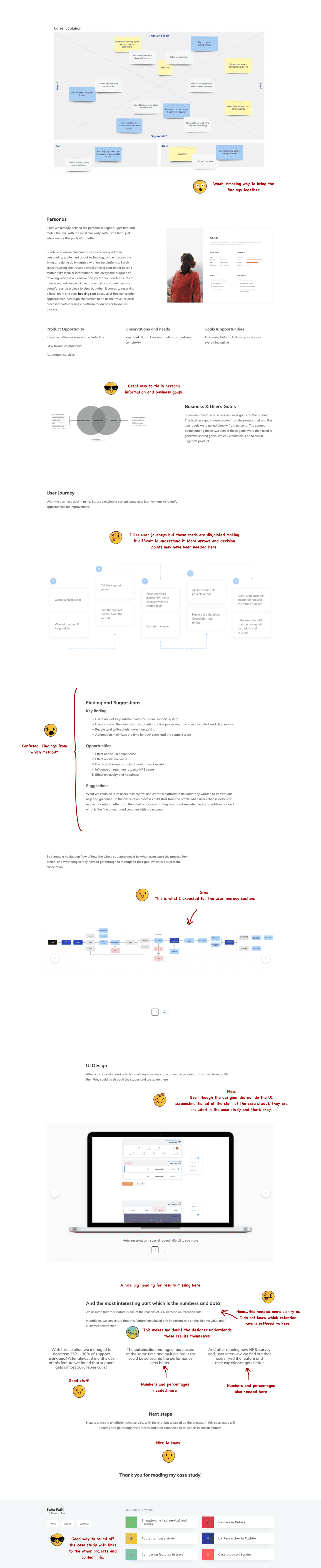
We will evaluating a Junior UX researcher’s portfolio who transitioned from a UI/UX designer to a UX Designer in 2022. Saba Fathi is a currently a UX Researcher & product person who is very passionate about developing simple yet innovative experiences. We will evaluate the portfolio as a recruiter would when going through design application for a UX role. There are some obvious mistakes that I identified that one should avoid but overall a good portfolio for a Junior designer starting out.
Takeaways:
Ensure you have case study thumbnails that relate to the project and the type of platform you were designing for(App, web etc).
Always use case study headings and subtitles that help the reader understand what the project is about
If you show a design process, try to show how each step in the design process was conducted and how it flows into the next step
Always show numbers for context and credibility. Number of testers, number of survey responses, etc.
Today we review Benny Sun’s fantastic design portfolio. What makes it interesting is that Benny transitioned from UX/UI designer to Principal User researcher at Morgan Stanley. He has a background in the educational sector and was a R&D researcher for a Edtech company amongst other things. As usual, I will outline what he does particularly well and share some practical takeaways that you can replicate in your UX portfolio. If you are transitioning to UX or already applying to UX jobs this portfolio review will be insightful.
Let’s begin.
Practical Takeaways
Keep to a consistent look for your UX portfolio projects with clear understandable headings and sub-headings.
Project summaries are super helpful for recruiters who are pressed for time. Include them.
Ensure that your UX portfolio reads well by outlining a design process and show how each step feeds into the next
When showing design screens, sketches or wireframes help the reader by showing annotations and connected userflows.
Always try to be descriptive about how many participants took part in a study and what the results where.
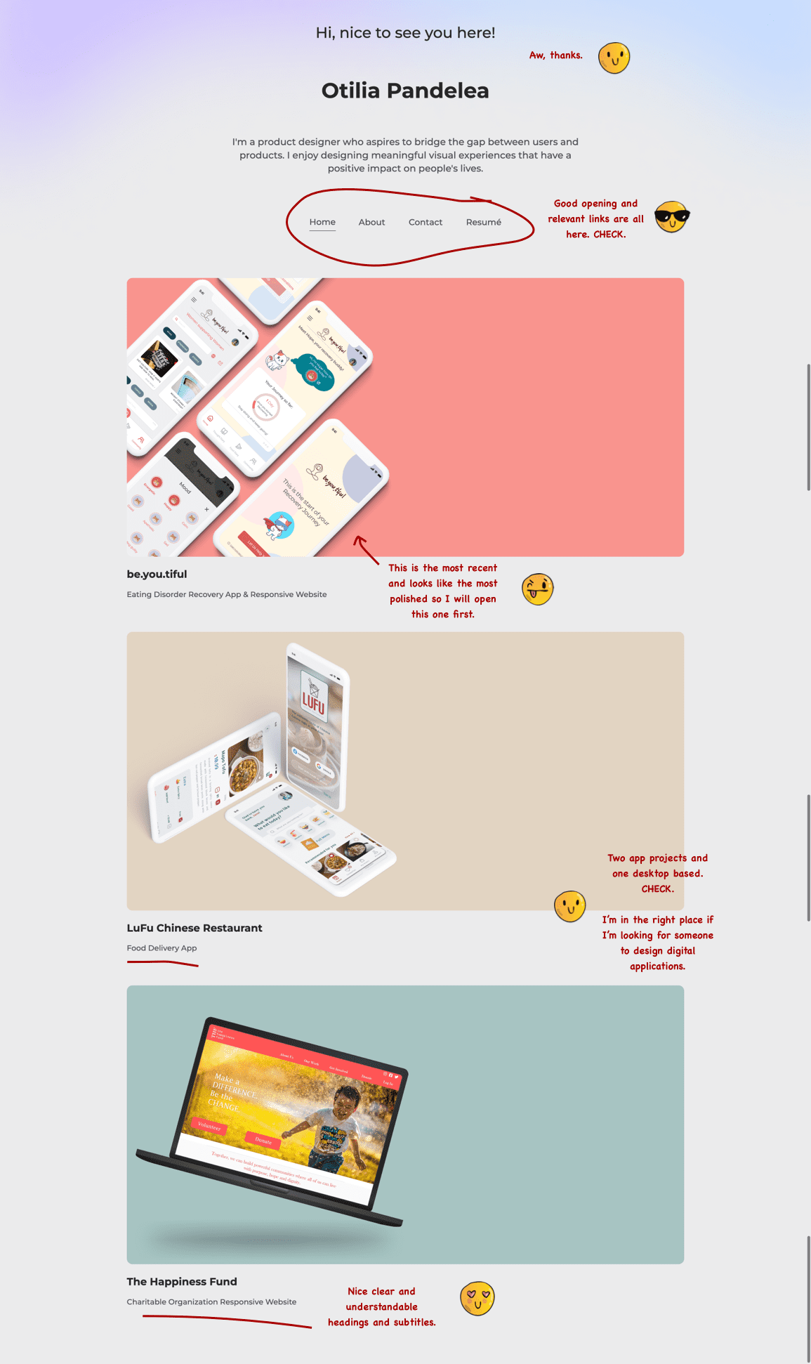
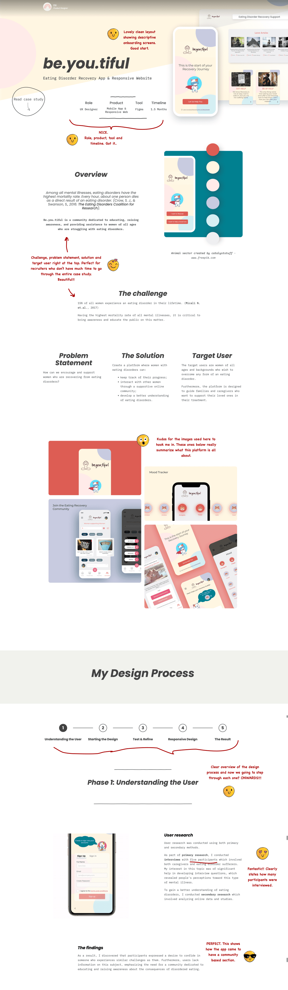
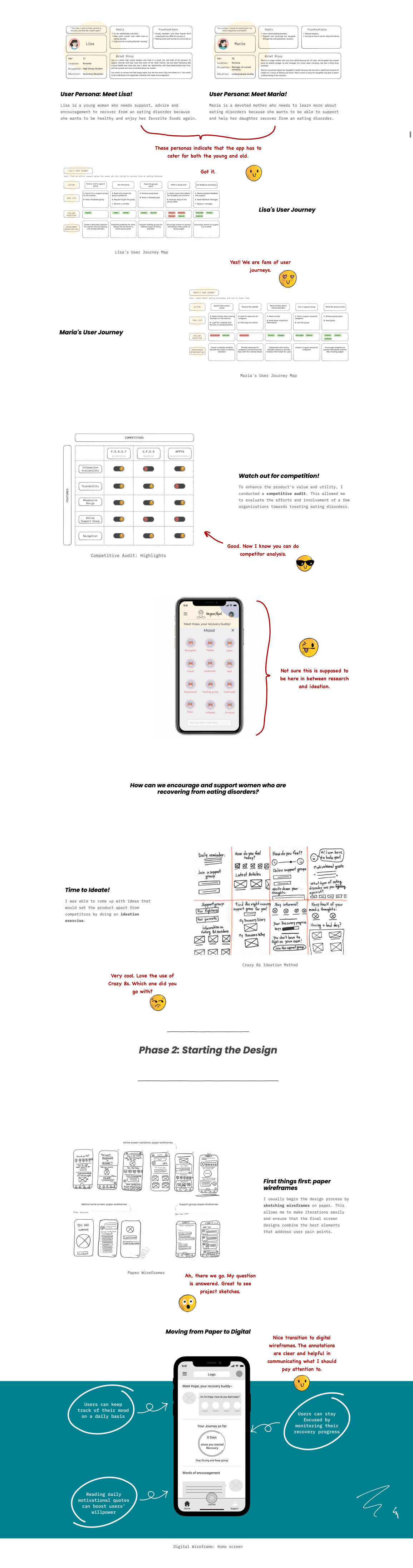
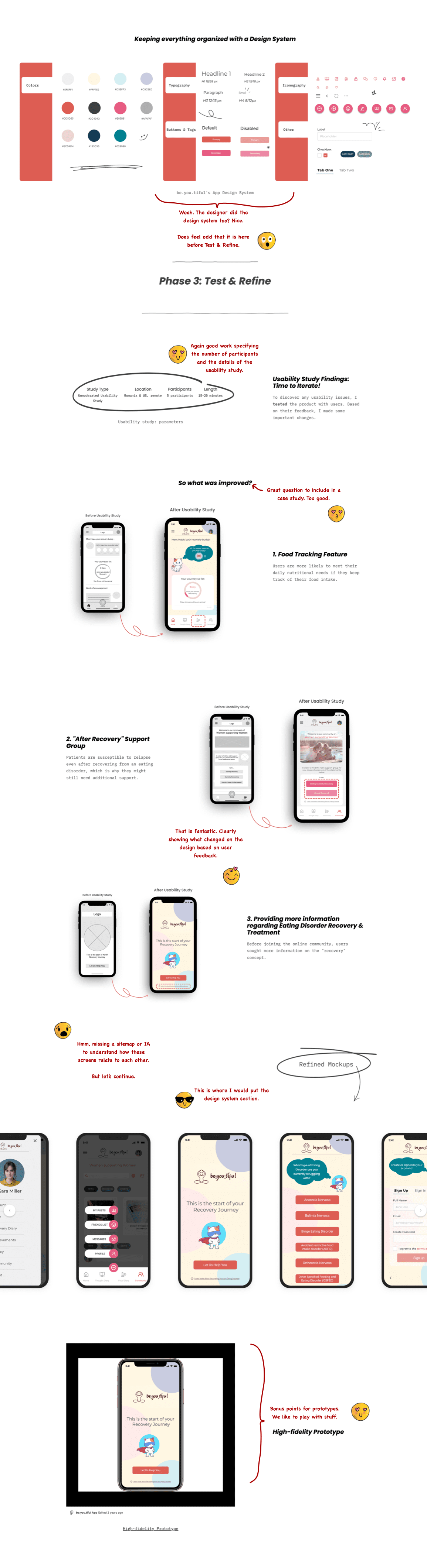
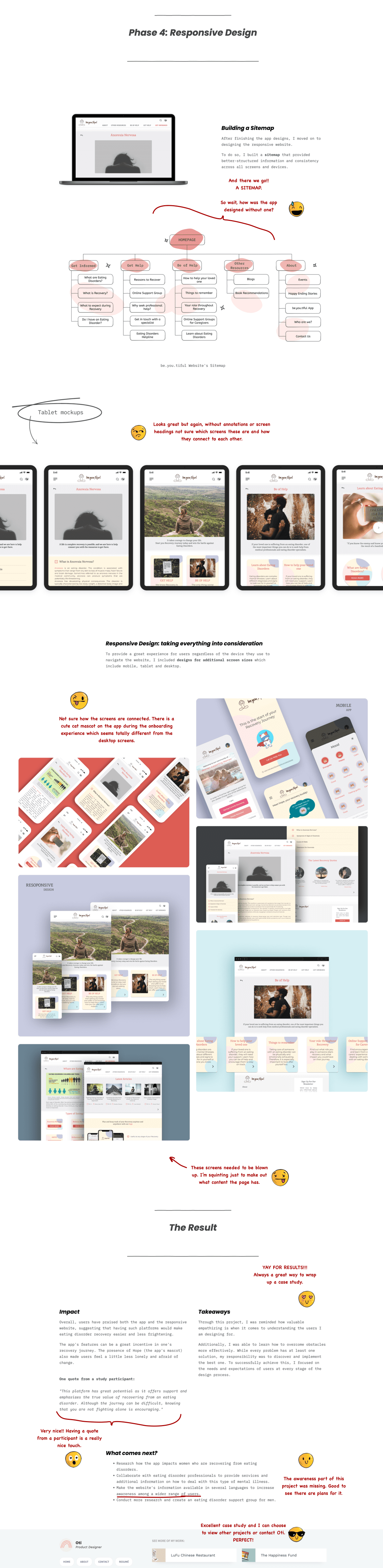
Today we evaluate Otilia Oandelea’s portfolio and UX work. Otilia is a UX & product design intern with 2+ years of experience and finished the Google UX Design Professional course in 2022. Despite being entry level designer, the portfolio is presented really well. I will highlight what UX recruiters and UX hiring managers look for when evaluating such a portfolio using emojis to indicate my emotions.
Takeaways: – Ensure that the site is easy to navigate and has links for an About page, Contact details and resume/LinkedIn -Use clear project imagery and project headings to help guide recruiters and hiring managers – A project summary upfront is critical because recruiters do not spend long on a single application among hundreds – Show before and after screens as your recruiter will not have as much project context as you do about what changed – Showing quotes from usability test participant is great for qualitative feedback around product satisfaction – Major bonus points for adding a prototype – If you do not have results or the project is not launched yet, reflections or “what comes next” are a great way to end a project
As a UX team manager and recruiter, I will be reviewing a Google Certification Course case study from Kevin, a self-taught UX designer based in Illinois. He decided to enroll in the Google UX Design Certificate Program in hopes of enhancing the limited amount of UX knowledge he already had. He studied Creative Technologies, which is an interdisciplinary major that covers several topics such as motion graphics, interactivity, and web design.
I will approach the UX portfolio the same way we normally do when hiring for a entry level designer.
Let’s get into it.
In conclusion
The Google Course definitely seems to give students a good basic UX education framework to help them build a portfolio. This case study was decent but incomplete which introduces doubt in a recruiter’s mind. There are certain sections that needed more information and some that did not make sense.
Takeaways:
Have descriptive project headings so that recruiters know which one may be relevant to them.
Always have a good summary of the problem, designer project role, project type, and when the project was done.
For any UX method used, detail why the method was picked, what the deliverables were, and how this influenced the next steps.
Show iterations, sketches, wireframes alongside sitemaps and user flows.
Detail how testing is conducted, how the feedback was incorporated and if the final design was retested
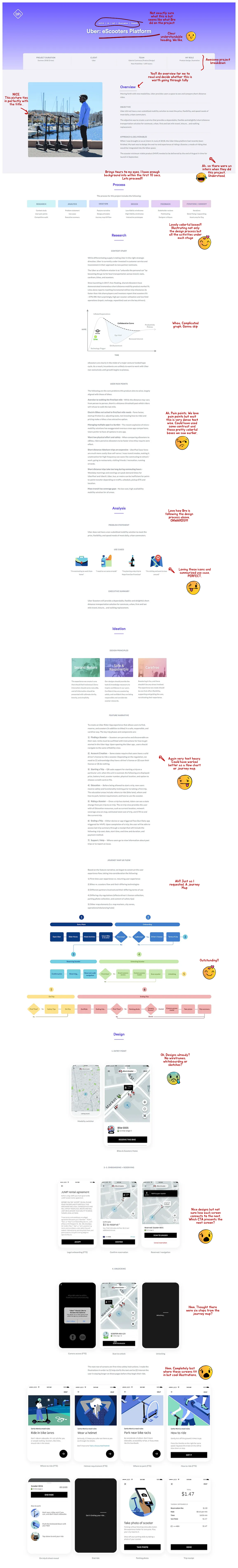
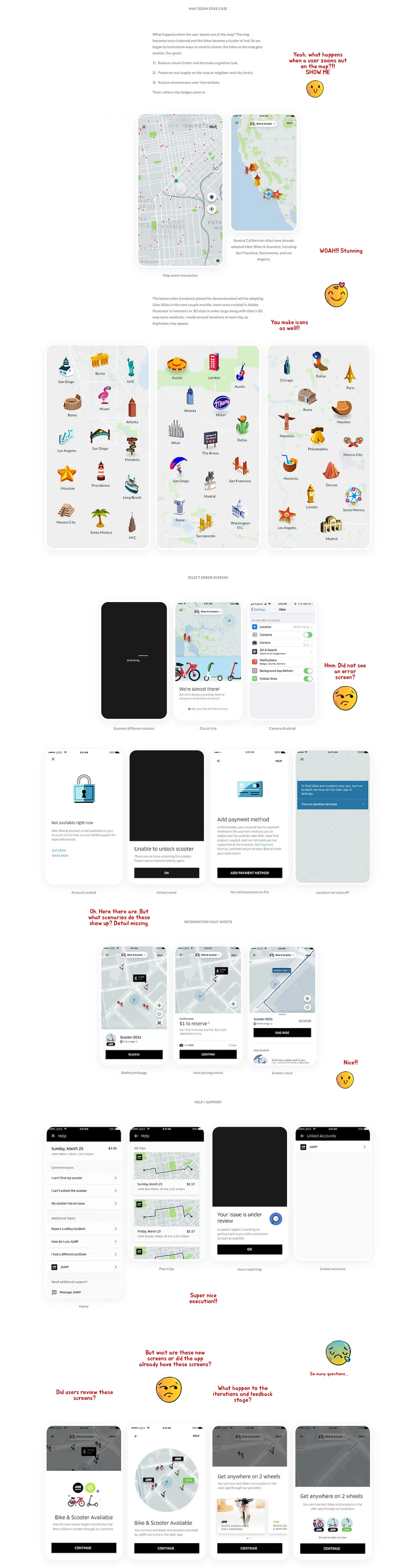
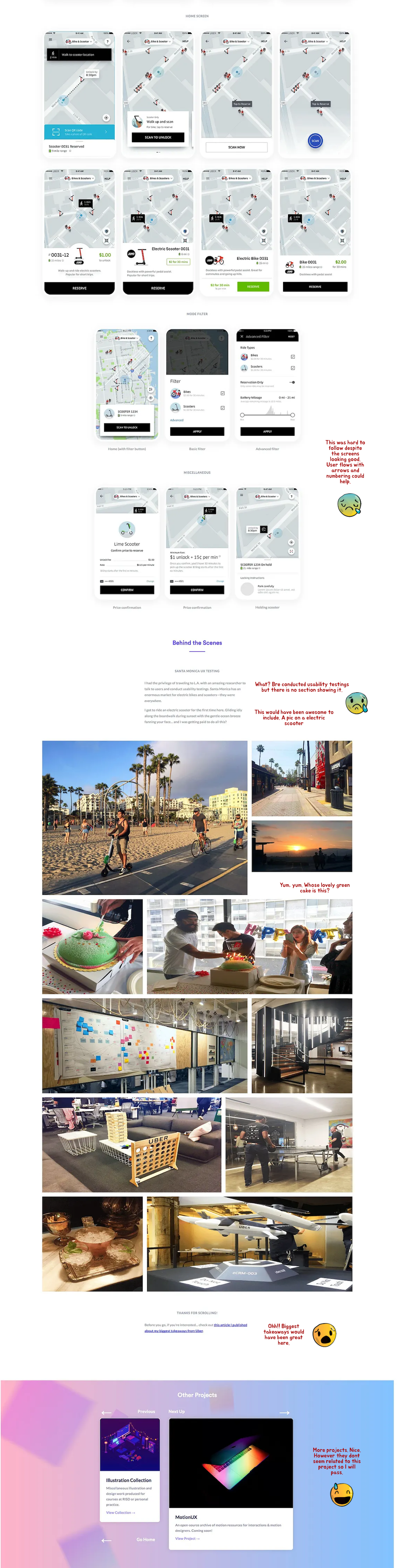
Today, I will visually take you through how recruiters evaluate a portfolio case study. This a portfolio review of Bre Huang’s internship case study titled Uber Scooters Platform. I chose this case study because despite being an entry level project, it is presented really well. Bre is a product designer, illustrator, and animator based in San Francisco and working at Uber Design.
Let dive in.
Conclusion: I would bring in Bre for a design interview. From this case study alone, Bre Huang’s strengths lie in the graphical and user interface side of things. And that’s not a bad thing as their passion visibly lie there. Despite having done usability testing there was no section dedicated to it nor the iteration based on user feedback. There is a lot more focus on icons and illustrations. A UI role would definitely be better suited but they may be trying to move in UX so I would not mark the application down based on that..
Key takeaways: – Have a good summary for recruiters who do not have much time – Avoid text heavy sections. They will not be read fully. – Show sketches, photos, rough wireframes if you have them – Present screens in a coherent manner through use numbers, annotations, and use of arrows – Include relevant projects in the portfolio for recruiters to make an informed decision
Today’s design brief is a redesign of an existing platform namely Spotify’s music app.
This is the seventh design brief or practice project for UI and UX designers looking to build a portfolio of credible work. Each detailed client brief is time-boxed, detailed, and crafted realistically enough to give you a hands-on experience of doing a real project. The design brief is meant to help you create realistic work you can add to your portfolio and test if design really is for you.
Designing an app is unique in that there are particular guidelines and best practices already outlined for Android and IOS that are different in some way to web patterns. This challenges the designer to be able to understand how platform constraints affect design.
As is usually the case, I have included the following with each design brief:
Timeline(For this to be realistic each brief has a timeline that is as close to real-world work as possible)
Objectives(What is REQUIRED by the client. This part usually trips designers up as they go off designing what is not required)
Platform(Where your designs will live. Understanding these platforms will give a well-considered solution)
Target audience (Users always come first and the design must accommodate the target audience’s pain points)
References(If you are not sure where to start, clients normally give a set of examples or references they like. The closer the design solution is to the references, the fewer revisions a designer will have to do)
Deliverables(Most importantly how the solution should be delivered. These represent what a well-detailed portfolio case study looks like so hit it out of the park)
Recruiter advice(Portfolio advice from creative directors, CEOs and leading design creatives from the biggest companies)
This will help you build your case study much faster as the project objectives and such are provided.
Let’s begin
Client:Spotify
Timeline 1–2 weeks. The project is expected to be completed within two weeks.
Objectives
Our goal is to redesign the Spotify music app to provide a richer and more personalized music streaming experience for users. The app should allow users to onboard, discover new music, create playlists, and easily access their favorite songs. “By 2026, the music streaming market is projected to reach $76.9 billion globally.” – Allied Market Research.berg
Success Metrics to Consider:
User engagement metrics, such as the number of songs listened to and playlists created User signups and ratings Conversion rate for concert ticket purchases through the app Number of app downloads and active users
Target audience
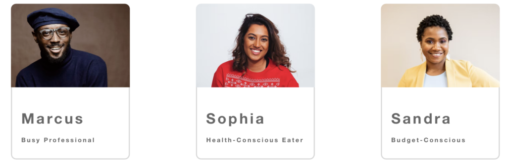
Marcus Lee, 35 | Musician NEEDS Likes to create and share his own music with others. He wants a platform that allows him to easily collaborate with other artists, share his work, and get feedback from the community. Finds it challenging to get his music noticed in the crowded music industry and struggles to find a platform that caters specifically to independent artists like him.
Sophia Patel, 23 | Music Enthusiast NEEDS Enjoys discovering new artists and attending live concerts. She also likes to create playlists for different moods and occasions. Finds it frustrating when she cannot easily find new music recommendations or when she has to switch between multiple apps to listen to different genres.
Sandra Jenkins, 28 | Fitness Enthusiast NEEDS
Enjoys working out and needs music to keep her motivated during her exercise routine. She wants a platform that allows her to easily create workout playlists and discover new music that fits her workout style. Finds it frustrating when the music app doesn’t provide enough variety in workout music or when the app doesn’t have features that help her track her fitness goals.
Requirements
Please test our existing app with users to understand how the current functionality could be improved. Address their biggest pain point.
User-friendly interface that allows for easy navigation
Ability to personalize music recommendations based on user preferences
Option to create and save playlists
Feature for offline listening as a stronger offering
Integration with social media platforms for easy sharing
Ability to purchase concert tickets through the app
Platform
The app should be compatible with either iOS or Android devices. Pay attention to IOS and Android guidelines.
References that our company would like the app to follow in terms of structure and layout. It will be your job to replicate something close to these examples but add your creative flair to it.
Youtube Music Apple Music Pandora
Deliverables
• Onboarding screens – These screens will introduce the app to new users and explain how to use it. They might include a welcome message, an explanation of the app’s features, and instructions on how to create an account. • Homepage – displays recommended music based on user preferences, popular playlists, and trending songs. • Search – allows users to search for songs, artists, and playlists. • Playlist – allows users to create and save their own playlists. • Player – displays the current song playing, lyrics, and options for sharing or adding to a playlist. • Settings – allows users to personalize their music preferences, including genre and artist preferences.
Testing and Results section
Show your wireframes to 5 people and ask them using your designs what they think about them, what they would improve, and an overall rating.
Take their feedback, iterate the designs, and have a final round of testing with 5 users. See that you improve your overall rating. If not go back to the drawing board and change your designs and retest.
What to do next
Download a portfolio project PDF of this design project and all the other existing design projects to do in your own time.