Educator to Product Designer portfolio review

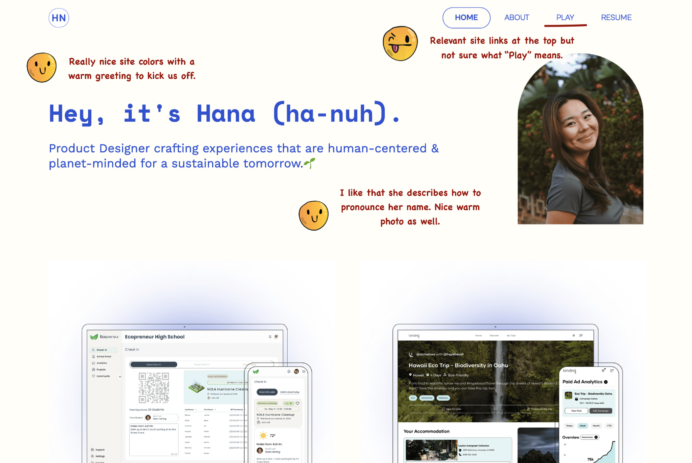
Today we evaluate a UX portfolio from a designer who transitioned from being an Educator to Product design. Before Hana Nakano found her passion for product design, she spent the majority of her 20s as a classroom teacher but I realized that life’s too short to stay in her comfort zone. This is not a great case study but there is plenty to learn from it.

As usual I will highlight what UX recruiters and UX hiring managers look for when evaluating such a portfolio using emojis to indicate my emotions.

Let’s begin.

Product Designer Portfolio example — Landing page

Takeaways: 

  • Use project thumbnails that help the recruiter understand what platform the design was for.
  • Ensure contact details and resume are easily accessible.
  • Be explicit in explaining how research is conducted, who was involved and what the findings are. 
  • Try to explain how the design improves metrics
  • Show your portfolio to two people to double check the case study.

Recruiter evaluation of Interaction Designer’s portfolio

Today we evaluate an interaction designer’s portfolio and UX work. Madison Green is a passionate product designer with a rich background in creating seamless mobile and web experiences for consumer-facing applications. She has 3+ years of experience, including working with Fortune 500 companies and dynamic startups. As usual I will highlight what UX recruiters and UX hiring managers look for when evaluating such a portfolio using emojis to indicate my emotions.

Let’s begin.

Takeaways:

  • Project headings need to be clear and understandable. Potentially incorporate the result into the heading for it to stand out.
  • What you name your project heading on the landing page should carry across into the detail view otherwise the recruiter will think they are in the wrong place. 
  • Provide clear imagery for project thumbnails if it’s a screen shot. It’s better to have a zoomed in image that shows features rather than a group of screens that are too small to show features.
  • Annotate wireframes and visual designs so that a recruiter knows what they are looking at. 
  • Avoid text heavy paragraphs which can be daunting to read for a recruiter. Instead highlight key points by bolding text or through use bullet points.

Recruiter evaluation of Junior UX portfolio

We will evaluating a Junior UX designer’s portfolio who transitioned from a UX/UI designer to a UX Designer in 2023. Ellen Shin is a currently a UX designer based in northern VA and her academic background is in communication and graphic design. We will evaluate the portfolio as a recruiter would when going through design application for a UX role. There are some obvious mistakes that I identified that one should avoid but overall a good portfolio for a Junior designer starting out.

Takeaways:

  • Ensure you have large clear images of work so that an recruiter can easily evaluate it.
  • If you frustrate a recruiter who is going through your design work, they can move on from your portfolio to the next one despite how good the work is. Keep things simple and clear.
  • Present work like wireframes and visual designs with headings, annotations and connected lines to better communicate work 

UX/UI design brief #9: Redesigning the Swedish Tourism Site (plus free download)

Today’s design brief is a redesign of the existing Swedish tourism site. This was an actual real project that I worked on at my digital agency but for the South African Tourism site. Obviously for our purposes I have changed the details to suit a public design brief. This is the 9th design brief or practice project for UI and UX designers looking to build a portfolio of credible work. Each detailed client brief is time-boxed, detailed, and crafted realistically enough to give you a hands-on experience of doing a real project. The design brief is meant to help you create realistic work you can add to your portfolio and test if design really is for you.

As is usually the case, I have included the following sections with each design brief:

  • Timeline (For this to be realistic each brief has a timeline that is as close to real-world work as possible)
  • Objectives (What is REQUIRED by the client. This part usually trips designers up as they go off designing what is not required)
  • Platform(Where your designs will live. Understanding these platforms will give a well-considered solution)
  • Target audience (Users always come first and the design must accommodate the target audience’s pain points)
  • References (If you are not sure where to start, clients normally give a set of examples or references they like. The closer the design solution is to the references, the fewer revisions a designer will have to do)
  • Deliverables (Most importantly how the solution should be delivered. These represent what a well-detailed portfolio case study looks like so hit it out of the park)
  • Recruiter advice (Portfolio advice from creative directors, CEOs and leading design creatives from the biggest companies)

This will help you build your case study much faster as the project objectives and such are provided.

Let’s begin

Client/Brand

Visit Sweden https://visitsweden.com/

Timeline

1–2 weeks. The project is expected to be completed within two weeks.

Objectives

We are looking for a redesign for the Swedish tourism website. The site is in need of a refresh and we require it to be visually appealing, easy to navigate, and provide all the necessary information to help visitors plan a trip. Our culture should be reflected across the site especially famous landmarks and common local native words.


“In 2020, domestic tourism accounted for approximately 85% of global tourism spending.” – Source: World Tourism Organization.

Success Metrics to Consider

Number of website visitors
Engagement rate (time spent on site, pages viewed per session)
Conversion rate (number of bookings or inquiries)
Customer satisfaction (rating and feedback)

Platform

Please design website screens for desktop (1440px wide and mobile view 365px wide).

Target Audience

Sarah Johnson, 28 | Adventure Traveler
NEEDS
She is looking for travel experiences that allow her to discover different cultures and trying new foods. Sarah wants to make sure that the travel experiences she books are safe and well-organized, with knowledgeable guides and good equipment.

James Lee, 42 | Family Vacationer
NEEDS
He is looking for travel experiences that are family-friendly, with activities that can be enjoyed by both kids and adults. James may be concerned about the cost of family travel, as well as the logistics of coordinating travel for multiple people. He may also be worried about keeping his family safe while traveling to unfamiliar places.

Marie Jensen, 55 | Cultural Tourist
NEEDS
She is interested in visiting museums, historic sites, and art galleries, and may also enjoy attending cultural events like concerts and festivals. She values comfortable accommodations and good food, but is primarily motivated by her desire to learn. Maria may be concerned about language barriers and navigating unfamiliar cities; accessibility and mobility issues.

Specifications/ Limitations

Site must load quickly hence any large interactions must be kept to a minimum.

References

References that our company would like the website to follow in terms of structure and layout. It will be your job to replicate something close to these websites but add your creative flair to it.

Visit Qatar – https://visitqatar.com/
Airbnb Experiences – https://www.airbnb.com/experiences
Lonely Planet – https://www.lonelyplanet.com/
Visit California – https://www.visitcalifornia.com/

Deliverables

• Sketch of conceptual ideas and a sitemap
• Wireframes/UI designs of
Homepage: This should be visually appealing and provide an overview of the destination and the experiences on offer.
Things to Do: This section should provide information on the top tourist attractions, outdoor activities, and cultural experiences in the area.
Places to Stay: This section should provide information on the best hotels, resorts, and vacation rentals in the area.
Local Food: This section should highlight the local cuisine and provide recommendations for restaurants and food experiences.
Travel Tips: This section should provide helpful information for travelers, such as visa requirements, currency exchange, and transportation options.
Booking: This section should allow users to book tours and activities directly from the website.
Blog: This section should provide fresh and relevant content to attract visitors and improve SEO.

Testing and Results section

Show your wireframes to 5 people and ask them using your designs what they think about them, what they would improve, and an overall rating.

Take their feedback, iterate the designs, and have a final round of testing with 5 users. See that you improve your overall rating. If not go back to the drawing board and change your designs and retest.

Portfolio Advice from recruiters

I love to see how designers tackle complex problems in their portfolio case studies. It’s important to not only show the final product, but the process that got you there.
– Satish Kanwar, VP of Design at Shopify

I want to see a clear articulation of the problem, the design process, and the impact of the solution. Numbers and metrics are important, but so is the story behind them.
– Khoi Vinh, Principal Designer at Adob

What to do next

Download a portfolio project PDF of this design project and all the other existing design projects to do in your own time.

Recruiter Evaluation of a Junior UX researcher portfolio

We will evaluating a Junior UX researcher’s portfolio who transitioned from a UI/UX designer to a UX Designer in 2022. Saba Fathi is a currently a UX Researcher & product person who is very passionate about developing simple yet innovative experiences. We will evaluate the portfolio as a recruiter would when going through design application for a UX role. There are some obvious mistakes that I identified that one should avoid but overall a good portfolio for a Junior designer starting out.

Takeaways: 

  • Ensure you have case study thumbnails that relate to the project and the type of platform you were designing for(App, web etc).
  • Always use case study headings and subtitles that help the reader understand what the project is about
  • If you show a design process, try to show how each step in the design process was conducted and how it flows into the next step
  • Always show numbers for context and credibility. Number of testers, number of survey responses, etc.

UX/UI designer to Principal UX Researcher | UX portfolio review plus takeaways

Today we review Benny Sun’s fantastic design portfolio. What makes it interesting is that Benny transitioned from UX/UI designer to Principal User researcher at Morgan Stanley. He has a background in the educational sector and was a R&D researcher for a Edtech company amongst other things. As usual, I will outline what he does particularly well and share some practical takeaways that you can replicate in your UX portfolio. If you are transitioning to UX or already applying to UX jobs this portfolio review will be insightful.

Let’s begin.

Practical Takeaways

  • Keep to a consistent look for your UX portfolio projects with clear understandable headings and sub-headings.
  • Project summaries are super helpful for recruiters who are pressed for time. Include them. 
  • Ensure that your UX portfolio reads well by outlining a design process and show how each step feeds into the next
  • When showing design screens, sketches or wireframes help the reader by showing annotations and connected userflows.
  • Always try to be descriptive about how many participants took part in a study and what the results where.  

Recruiter Evaluation of a intern’s portfolio

Today we evaluate Otilia Oandelea’s portfolio and UX work. Otilia is a UX & product design intern with 2+ years of experience and finished the Google UX Design Professional course in 2022. Despite being entry level designer, the portfolio is presented really well. I will highlight what UX recruiters and UX hiring managers look for when evaluating such a portfolio using emojis to indicate my emotions.

Takeaways:
– Ensure that the site is easy to navigate and has links for an About page, Contact details and resume/LinkedIn 
-Use clear project imagery and project headings to help guide recruiters and hiring managers
– A project summary upfront is critical because recruiters do not spend long on a single application among hundreds
– Show before and after screens as your recruiter will not have as much project context as you do about what changed 
– Showing quotes from usability test participant is great for qualitative feedback around product satisfaction
– Major bonus points for adding a prototype 
– If you do not have results or the project is not launched yet, reflections or “what comes next” are a great way to end a project

UX portfolio review | Self taught UX designer with Google UX Certification

As a UX team manager and recruiter, I will be reviewing a Google Certification Course case study from Kevin, a self-taught UX designer based in Illinois. He decided to enroll in the Google UX Design Certificate Program in hopes of enhancing the limited amount of UX knowledge he already had. He studied Creative Technologies, which is an interdisciplinary major that covers several topics such as motion graphics, interactivity, and web design.

I will approach the UX portfolio the same way we normally do when hiring for a entry level designer. 

Let’s get into it.

In conclusion

The Google Course definitely seems to give students a good basic UX education framework to help them build a portfolio. This case study was decent but incomplete which introduces doubt in a recruiter’s mind. There are certain sections that needed more information and some that did not make sense. 

Takeaways:

  • Have descriptive project headings so that recruiters know which one may be relevant to them.
  • Always have a good summary of the problem, designer project role, project type, and when the project was done.
  • For any UX method used, detail why the method was picked, what the deliverables were, and how this influenced the next steps.
  • Show iterations, sketches, wireframes alongside sitemaps and user flows.
  • Detail how testing is conducted, how the feedback was incorporated and if the final design was retested 

Recruiter Evaluation of Bre Huang’s Portfolio Case Study

Today, I will visually take you through how recruiters evaluate a portfolio case study. This a portfolio review of Bre Huang’s internship case study titled Uber Scooters Platform. I chose this case study because despite being an entry level project, it is presented really well. Bre is a product designer, illustrator, and animator based in San Francisco and working at Uber Design.

Let dive in.

Conclusion:
I would bring in Bre for a design interview. From this case study alone, Bre Huang’s strengths lie in the graphical and user interface side of things. And that’s not a bad thing as their passion visibly lie there. Despite having done usability testing there was no section dedicated to it nor the iteration based on user feedback. There is a lot more focus on icons and illustrations. A UI role would definitely be better suited but they may be trying to move in UX so I would not mark the application down based on that.. 

Key takeaways:
– Have a good summary for recruiters who do not have much time
– Avoid text heavy sections. They will not be read fully.
– Show sketches, photos, rough wireframes if you have them
– Present screens in a coherent manner through use numbers, annotations, and use of arrows
– Include relevant projects in the portfolio for recruiters to make an informed decision


Freebie: UX Sketchbook, 15 Free printable browser screens

Looking to communicate your design concepts more clearly? Struggling with draw a straight line let alone a wireframe sketch? Not to worry, we have created something just for you.


Sketch out your concepts on a grid, write out your project feature notes and detail the scenario for that sketch. A variety of grid based browser screens are available for desktop and mobile views. This sketchbook is designed to make sketching and design communication easier with your team or client.

All the screens are completely customizable, as the source file is provided and exports can be resize how you want them.


DOWNLOAD THIS RESOURCE